One Fine Secret challenges beauty norms and champions higher standards across the industry. A new brand identity and flagship-store presence elevates their clean-beauty philosophy with a warm, value-led visual world.
Scope
- Brand Identity
- Brand Guidelines
- Brand Storytelling
- Brand Strategy
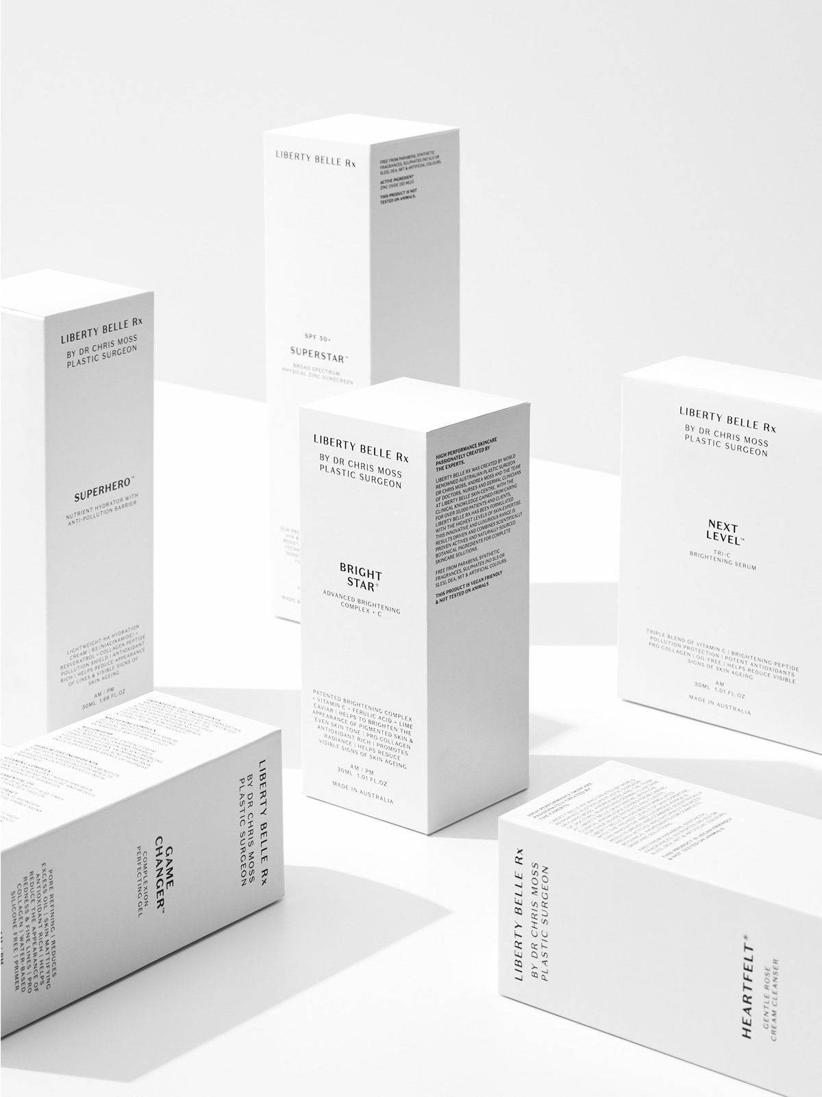
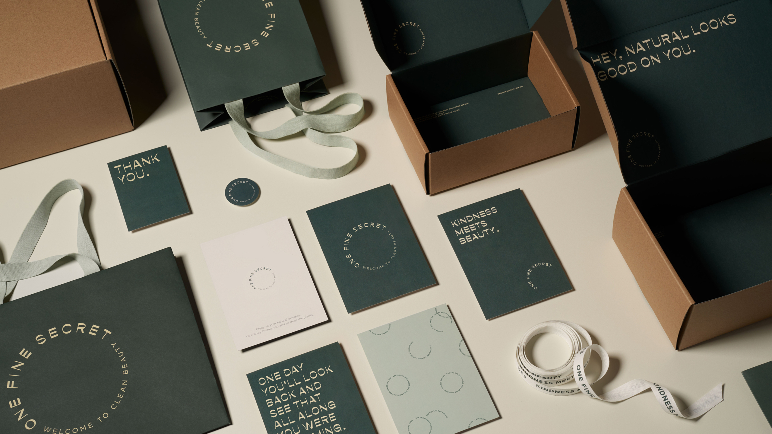
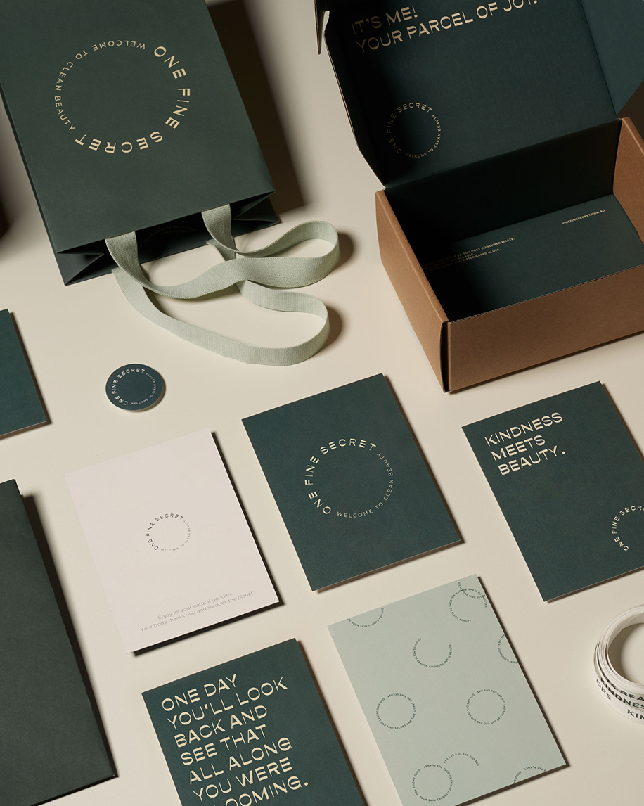
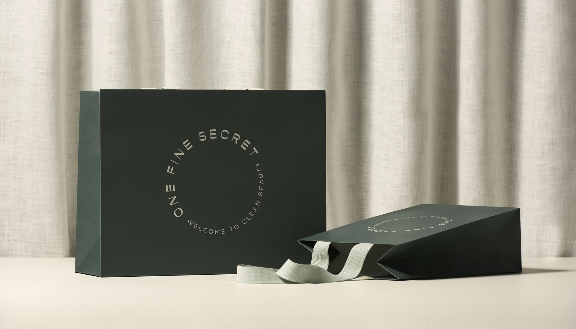
- Packaging
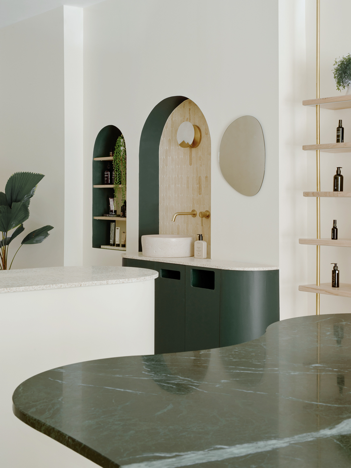
- Placemaking
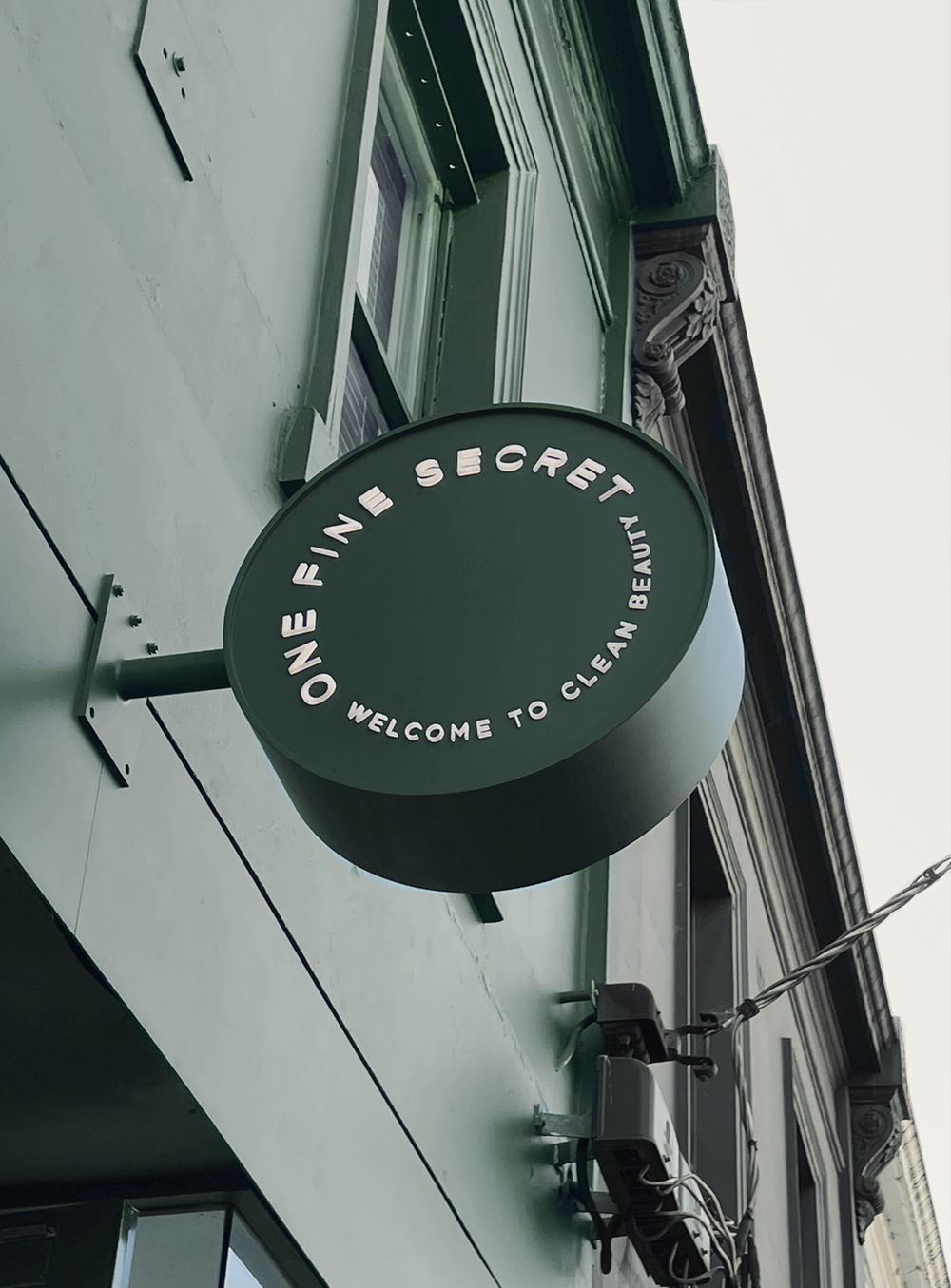
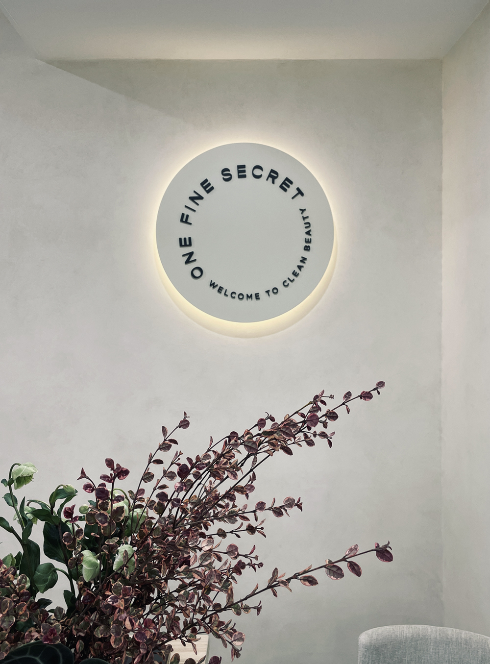
- Signage & Wayfinding
- Stationery
- Tone of Voice
Credits
Site photography by Pier Carthew
With a devoted following yet a name that hinted at its low profile, One Fine Secret challenges beauty norms and champions higher standards across the industry — for our health and for the planet. Their curation is rigorous: only products with 100% healthy ingredients and ethical practices make it onto the shelves. The rebrand needed to amplify this stance while capturing the warmth and integrity at the heart of the business.

We began with a workshop to deeply understand their values, ambitions and long-term vision. These conversations shaped a comprehensive Brand Blueprint that clarified their mission and, in turn, set the foundations for the rebrand.
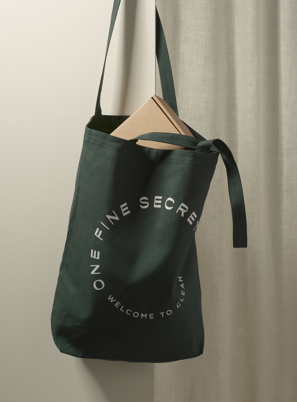
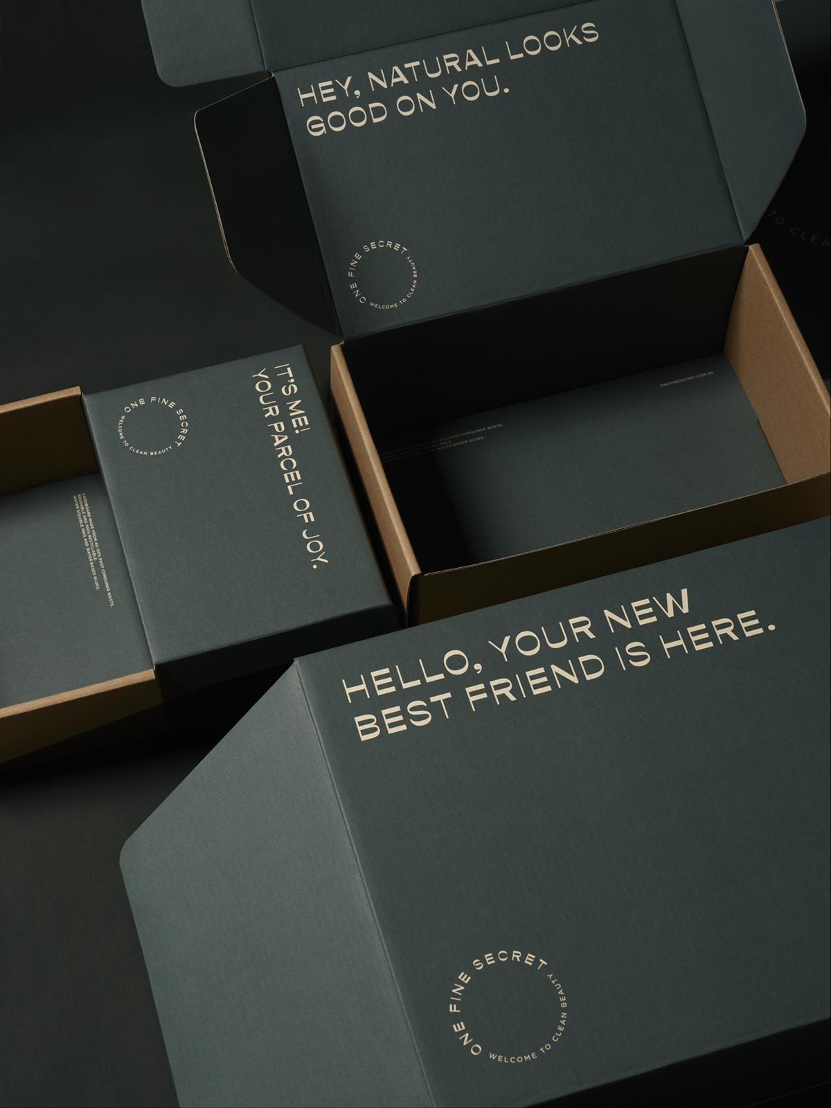
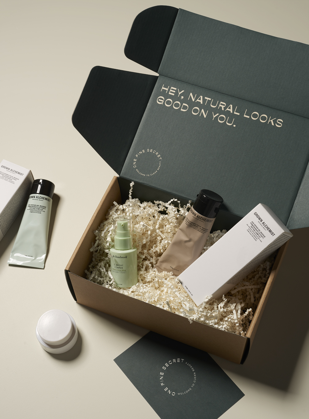
The result is a desirable, elevated brand identity anchored by a warm, conversational tone of voice. Its personality is rooted in the essence of Beauty meets Kindness — a genuine reflection of the founders themselves. Kind, clever and principled, One Fine Secret is a brand shaped by strong values and poised for meaningful growth.
We’re beyond thrilled with our new look for One Fine Secret, Ortolan did an incredible job capturing the essence of our brand. We couldn’t be happier with the design of our new logo and packaging.
Kayla Tjia
Founder, One Fine Secret