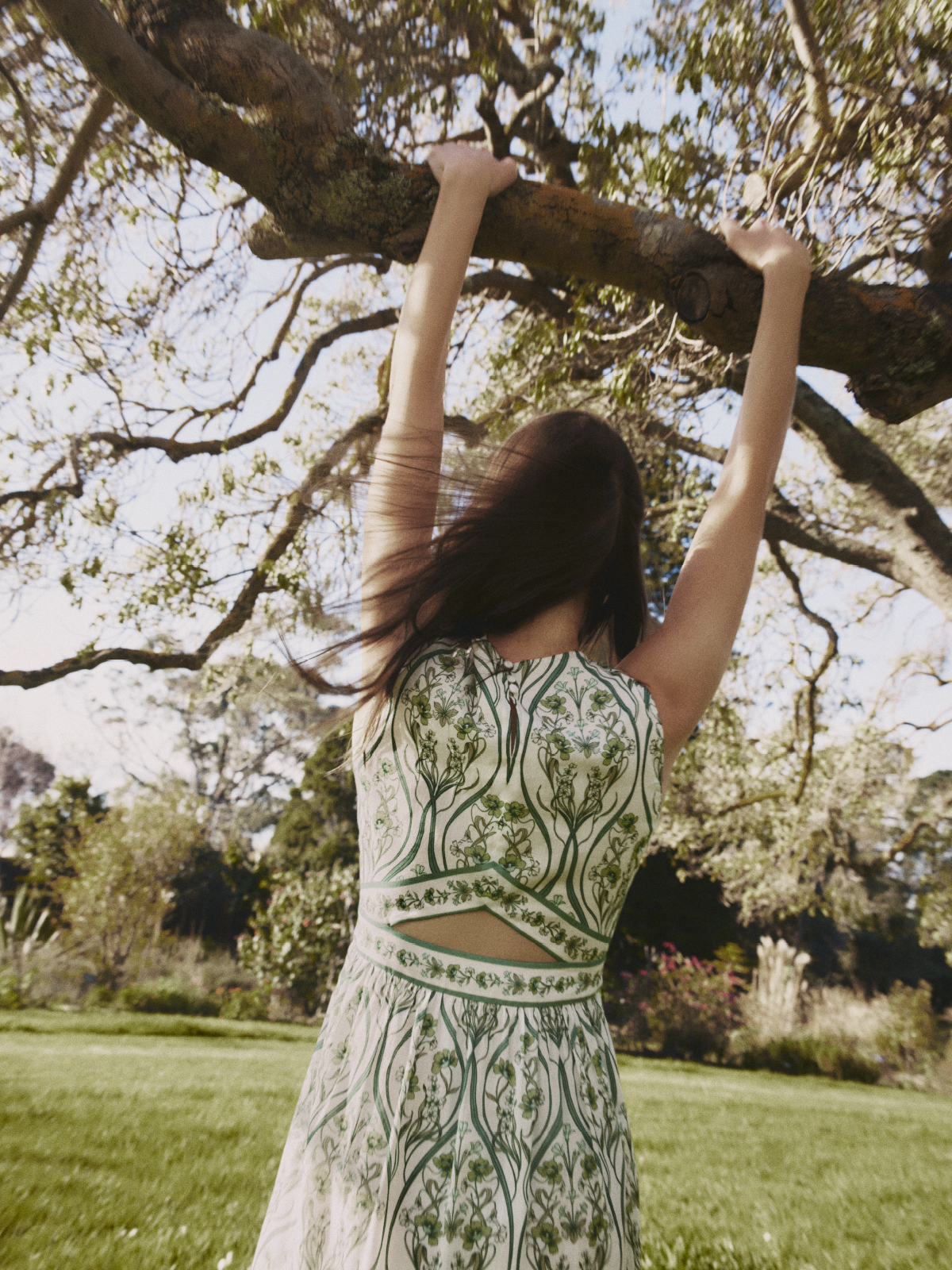
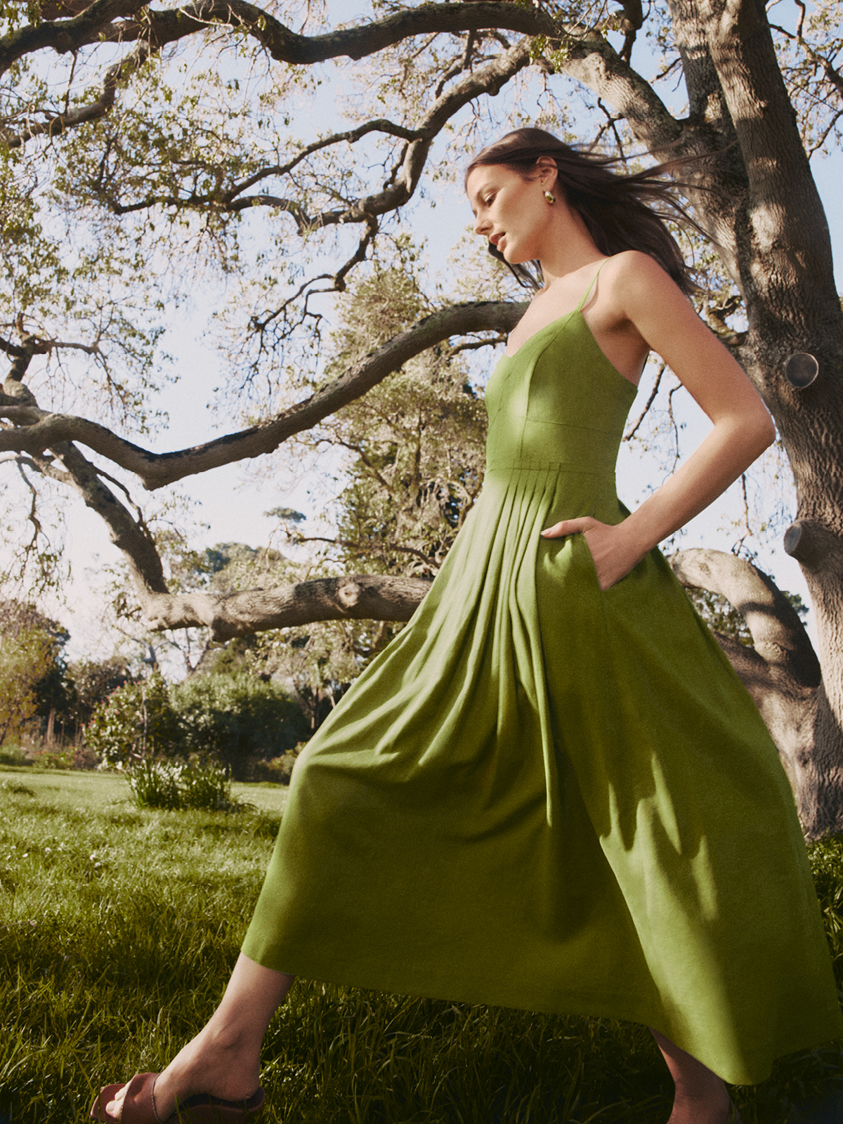
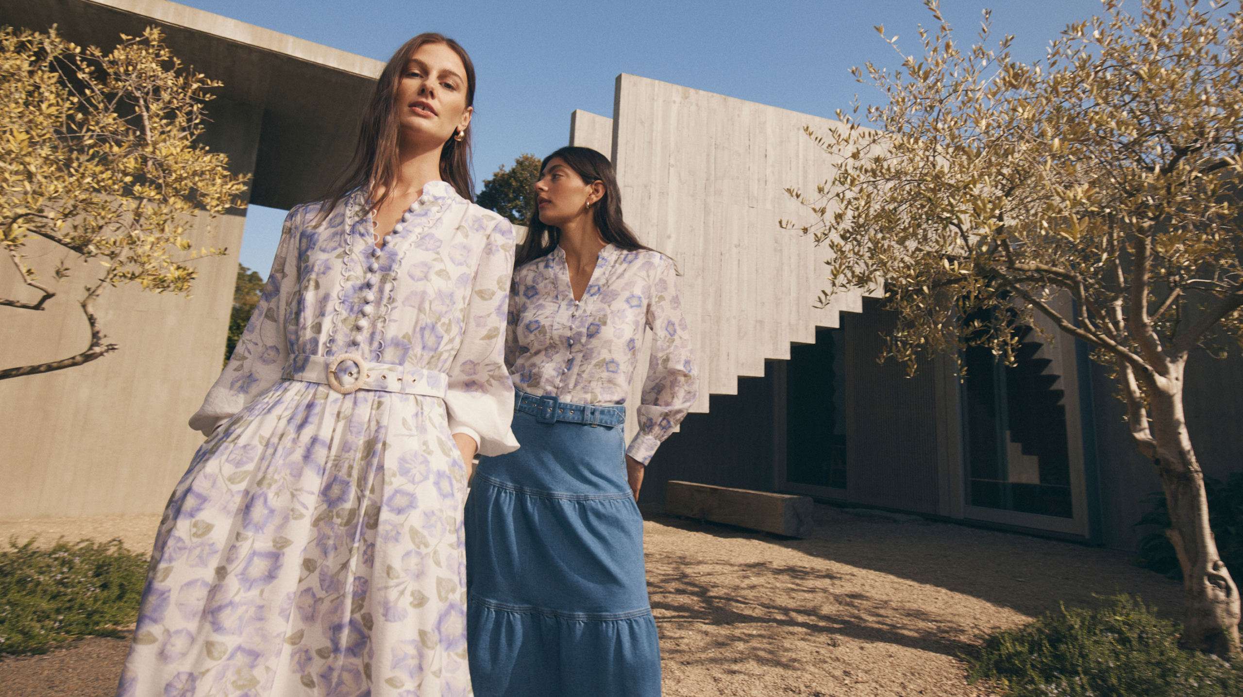
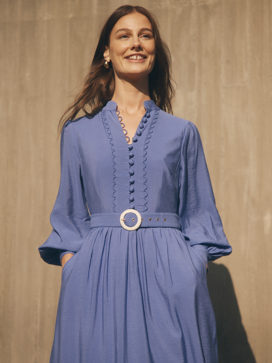
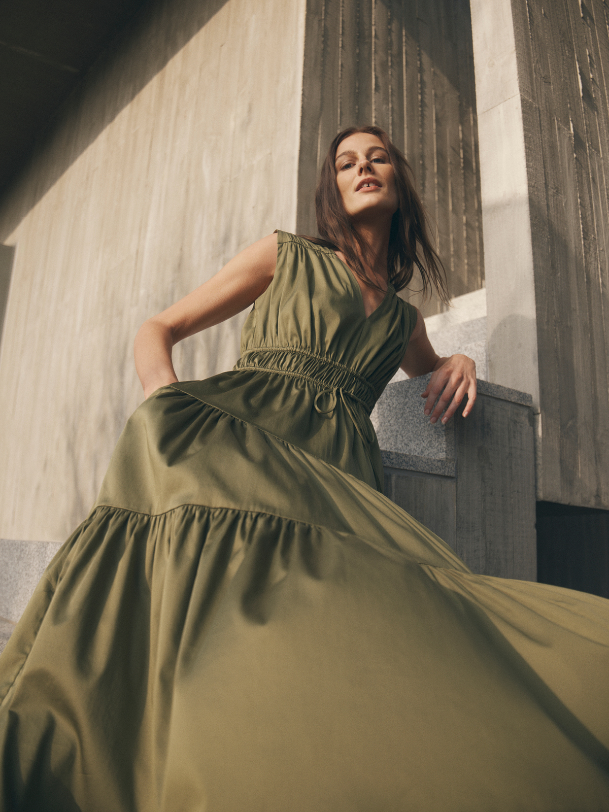
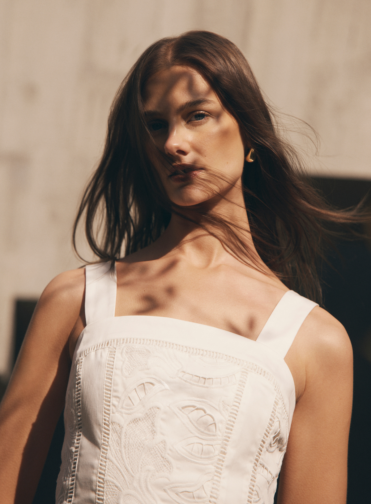
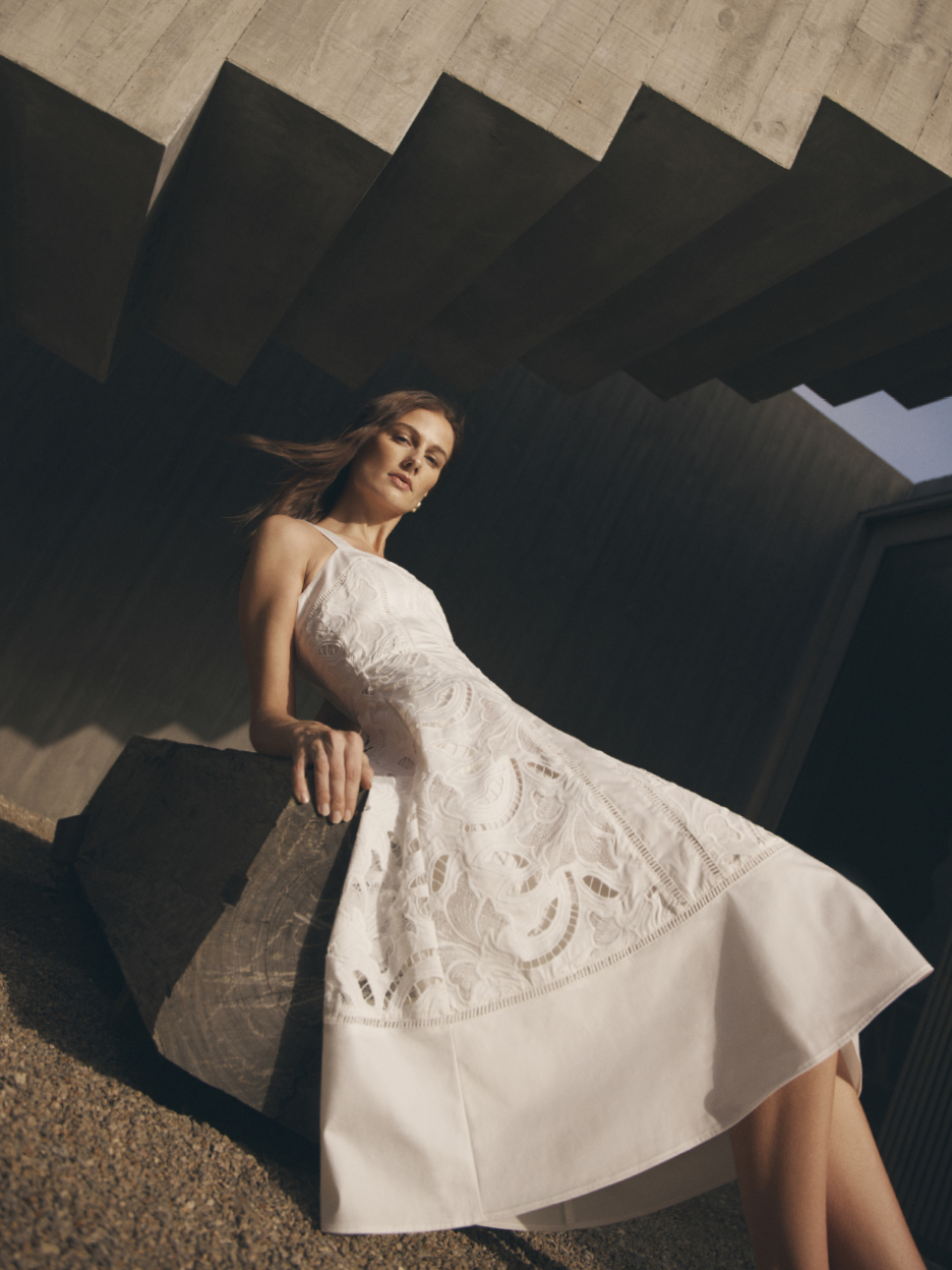
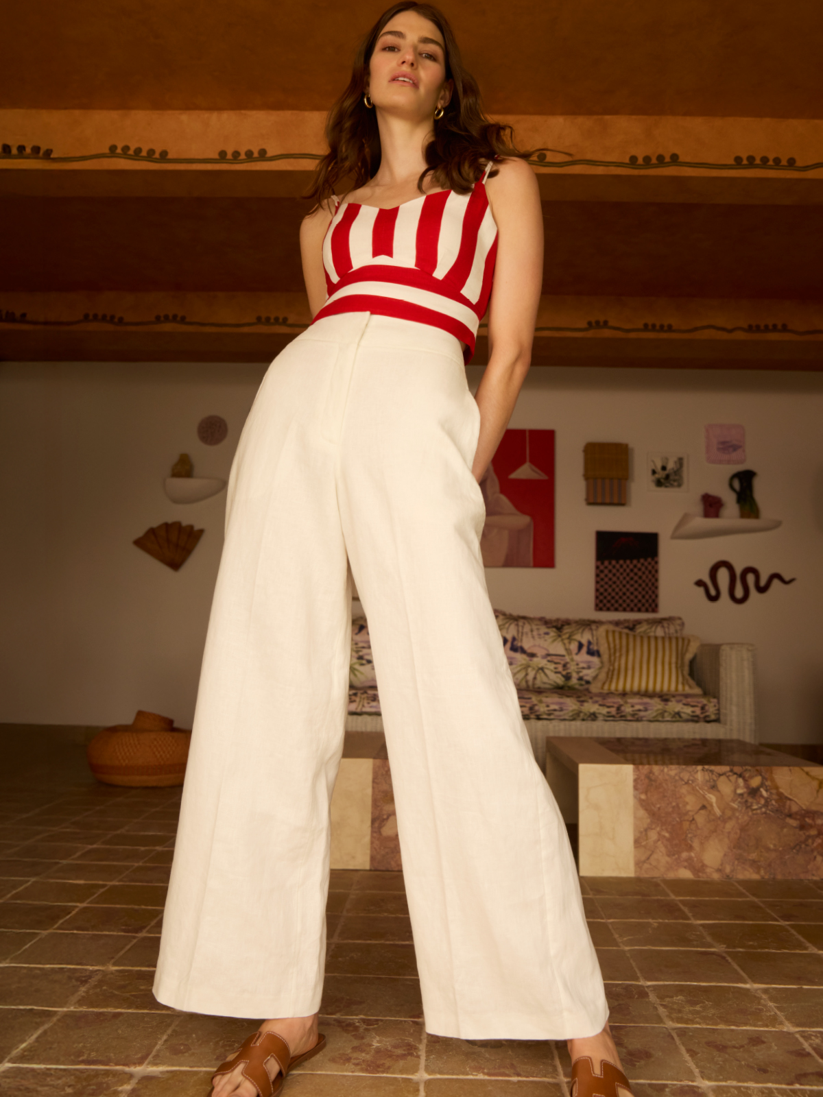
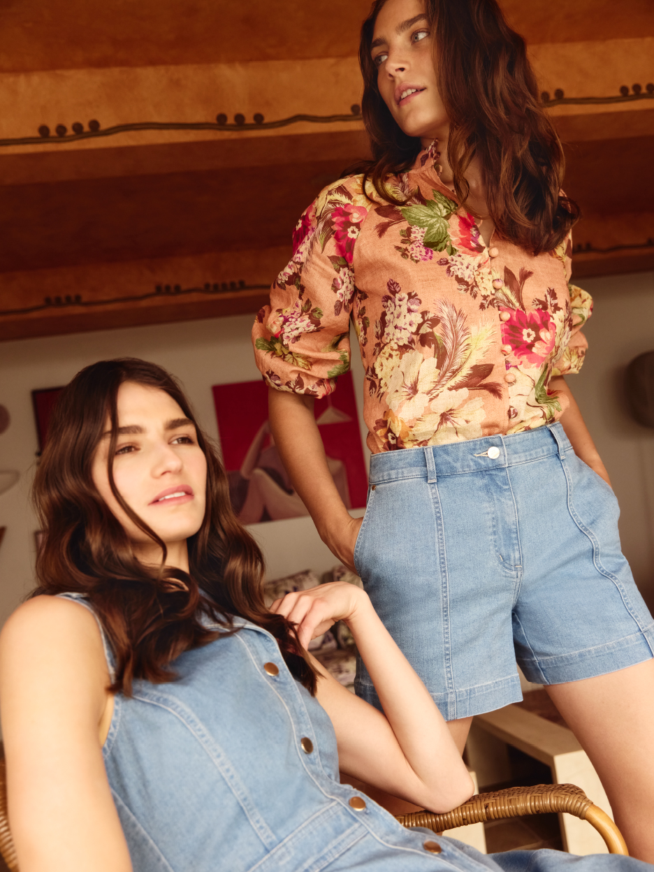
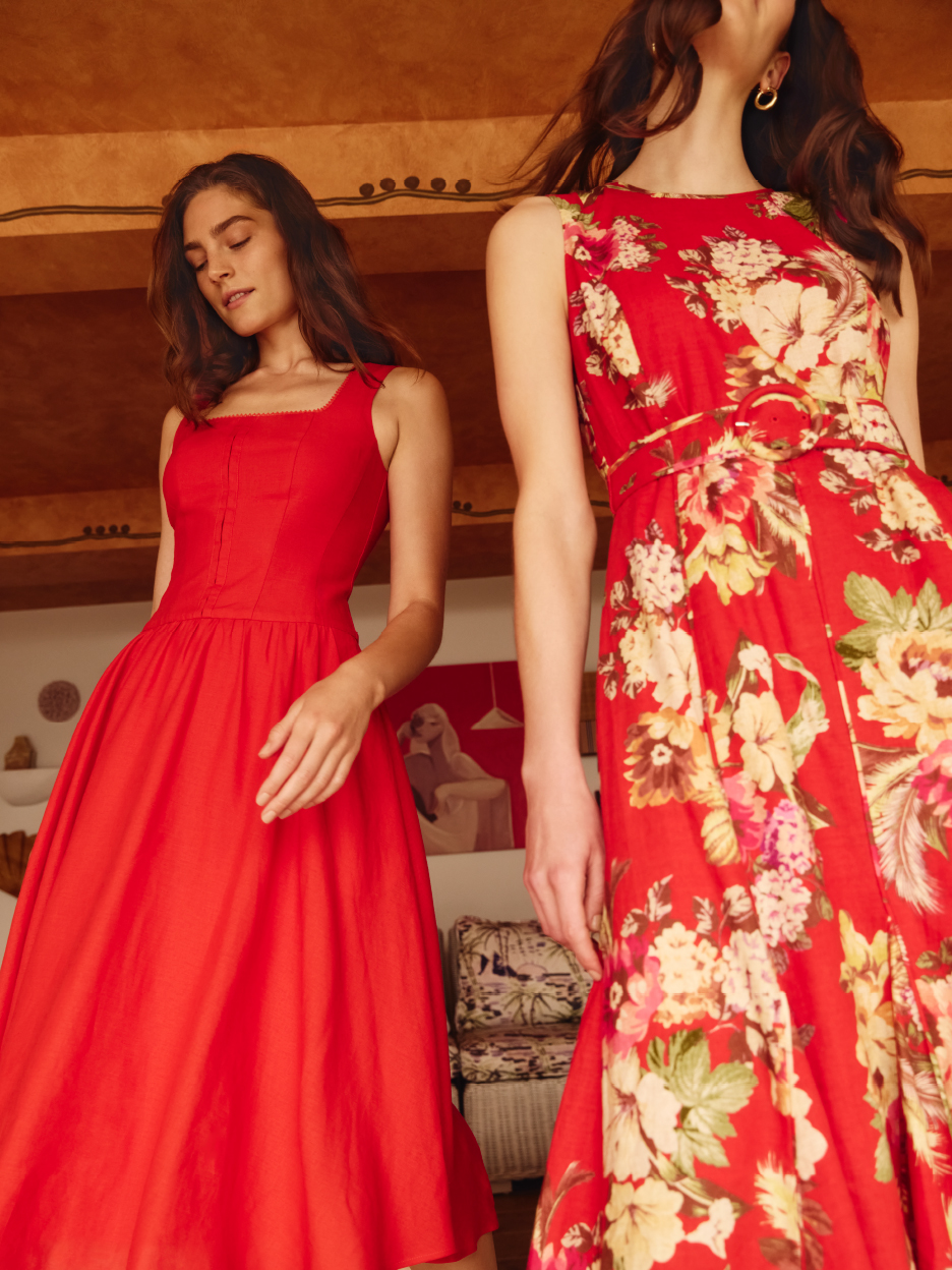
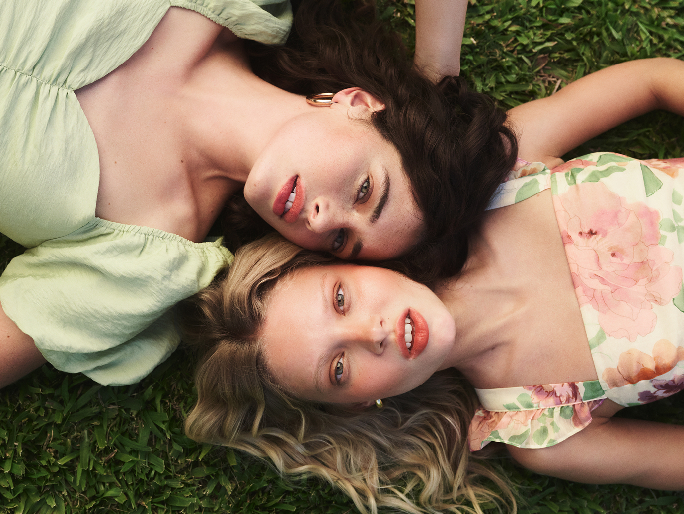
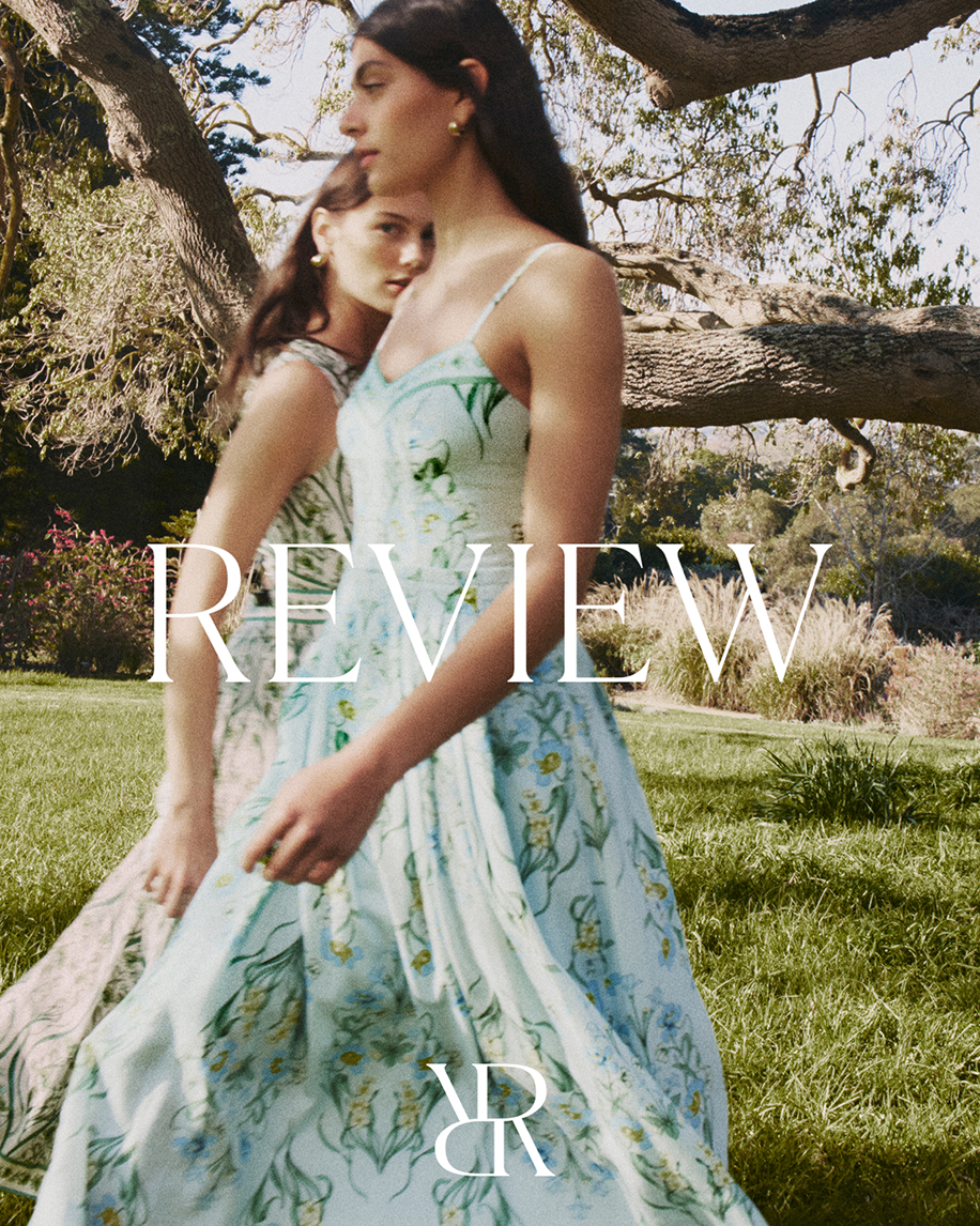
Inspired by signature prints, feminine silhouettes and intricate detailing, Ortolan designed a new identity that elevates the brand, reflects its core values and distinguishes it within the market.

Scope
- Brand Art Direction
- Brand Identity
- Campaign Art Direction
- Full Service Production
Credits
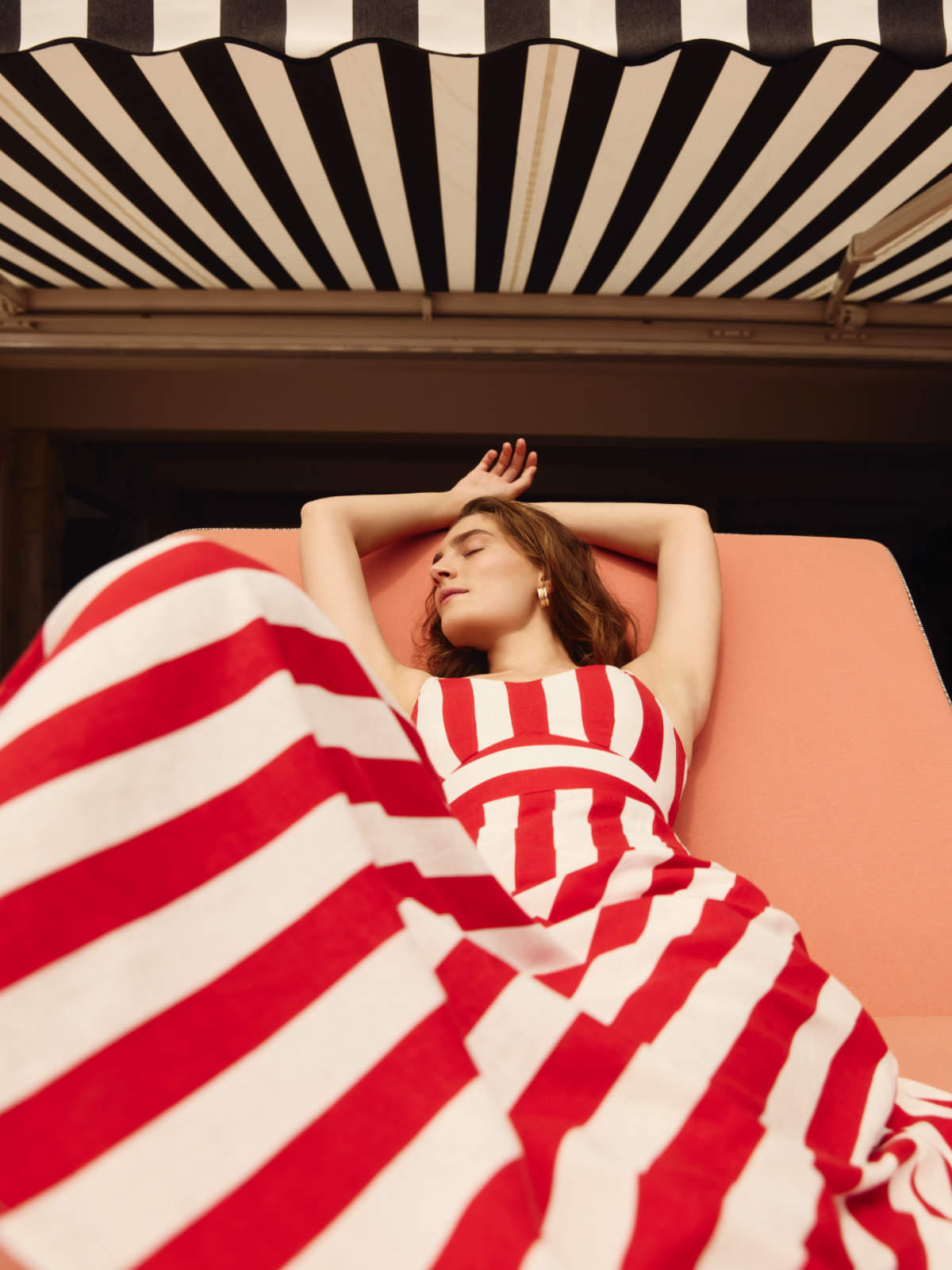
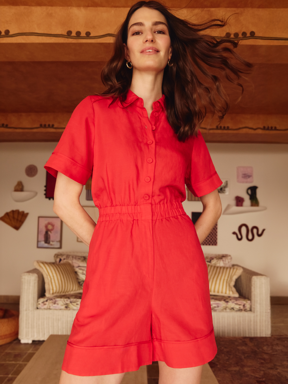
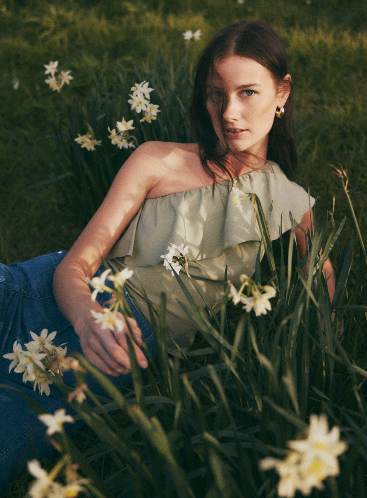
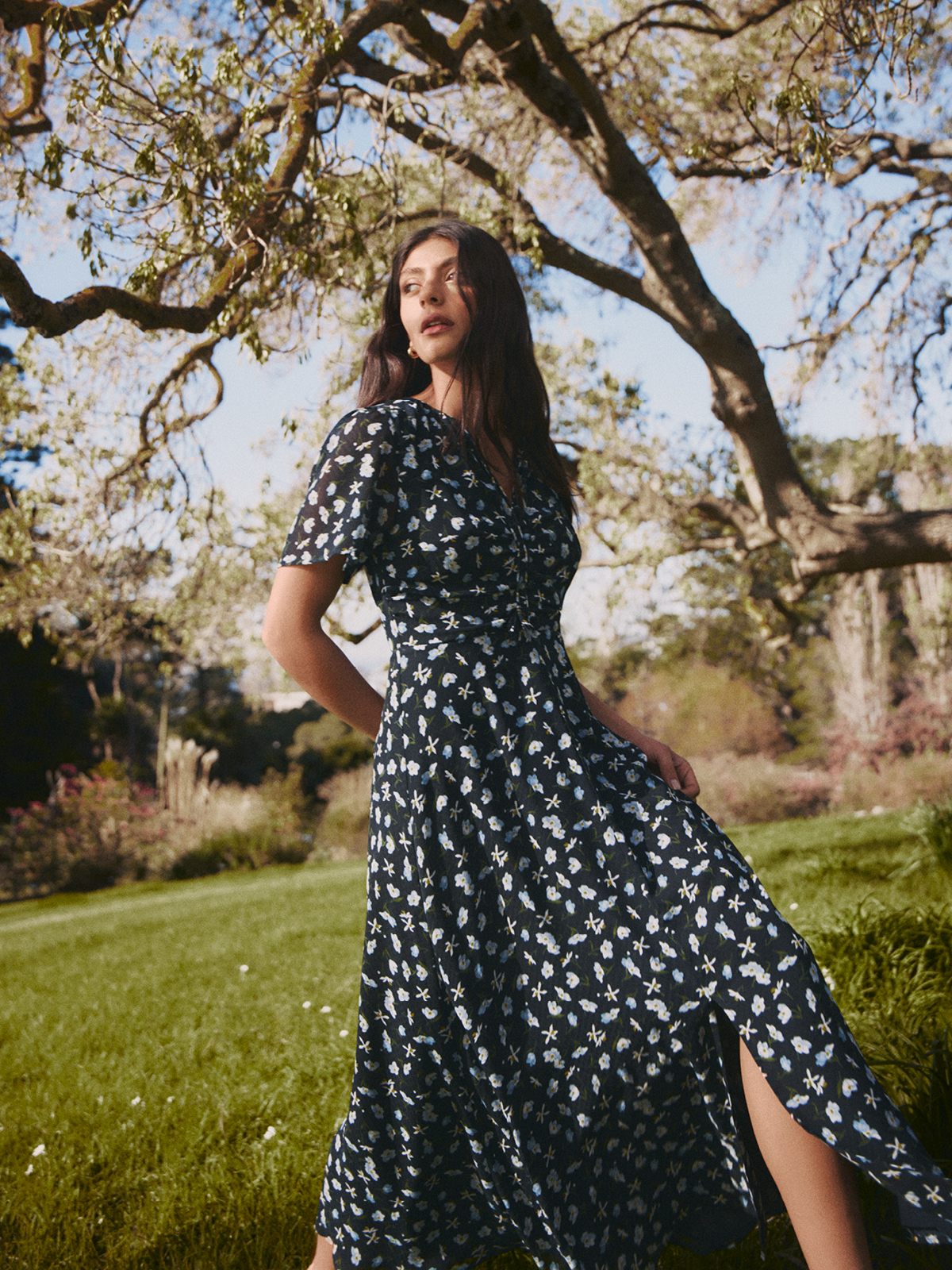
- Spring Campaign:
- Photography by Georges Antoni
- Motion by Justin Hart
- Styling by Emily Ward
- Summer Campaign:
- Photography by Daniel Goode
- Styling by Oriana De Luca
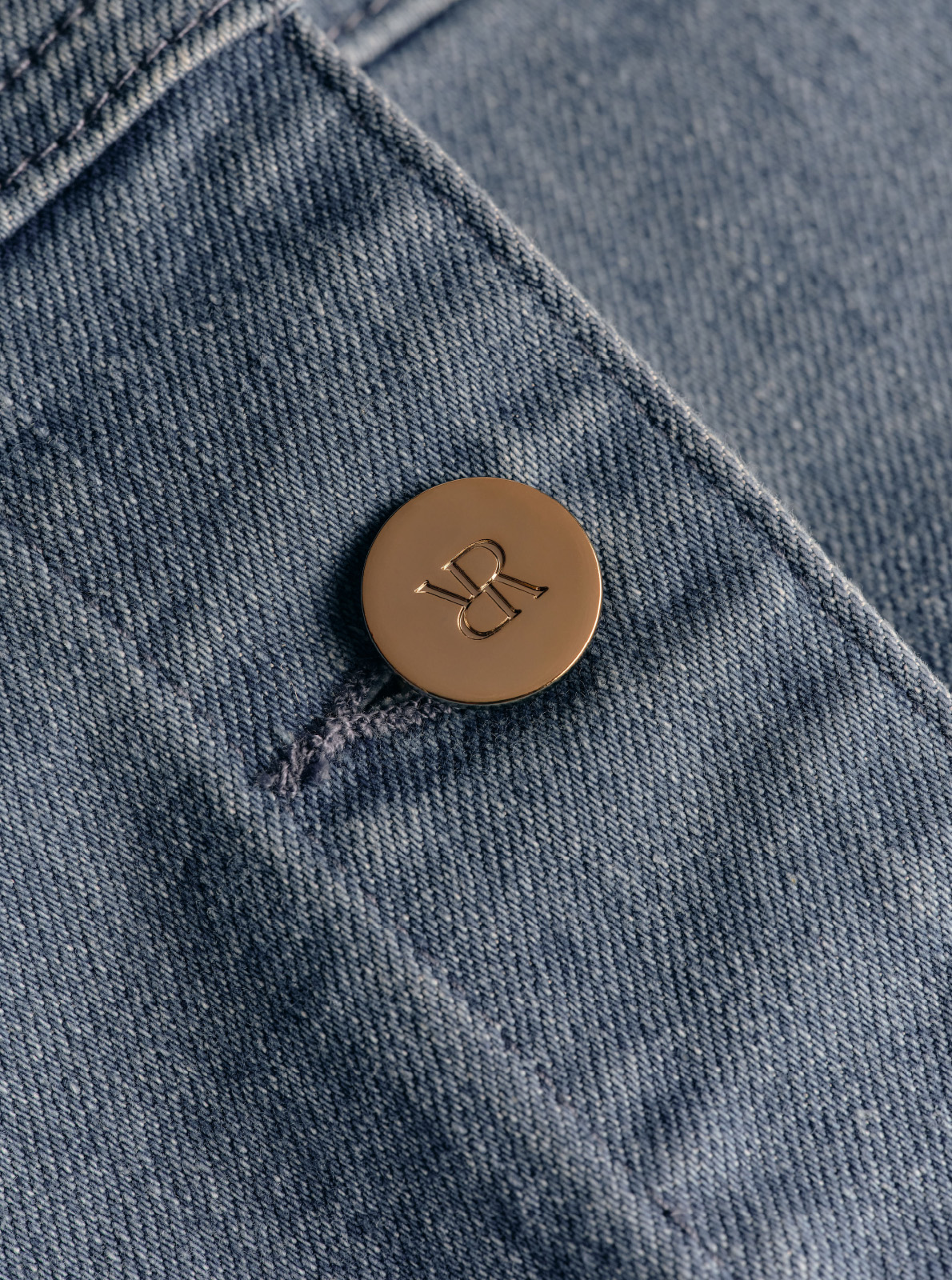
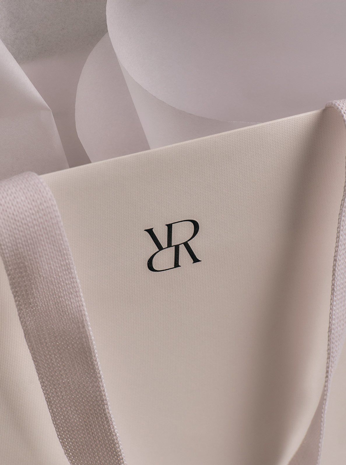
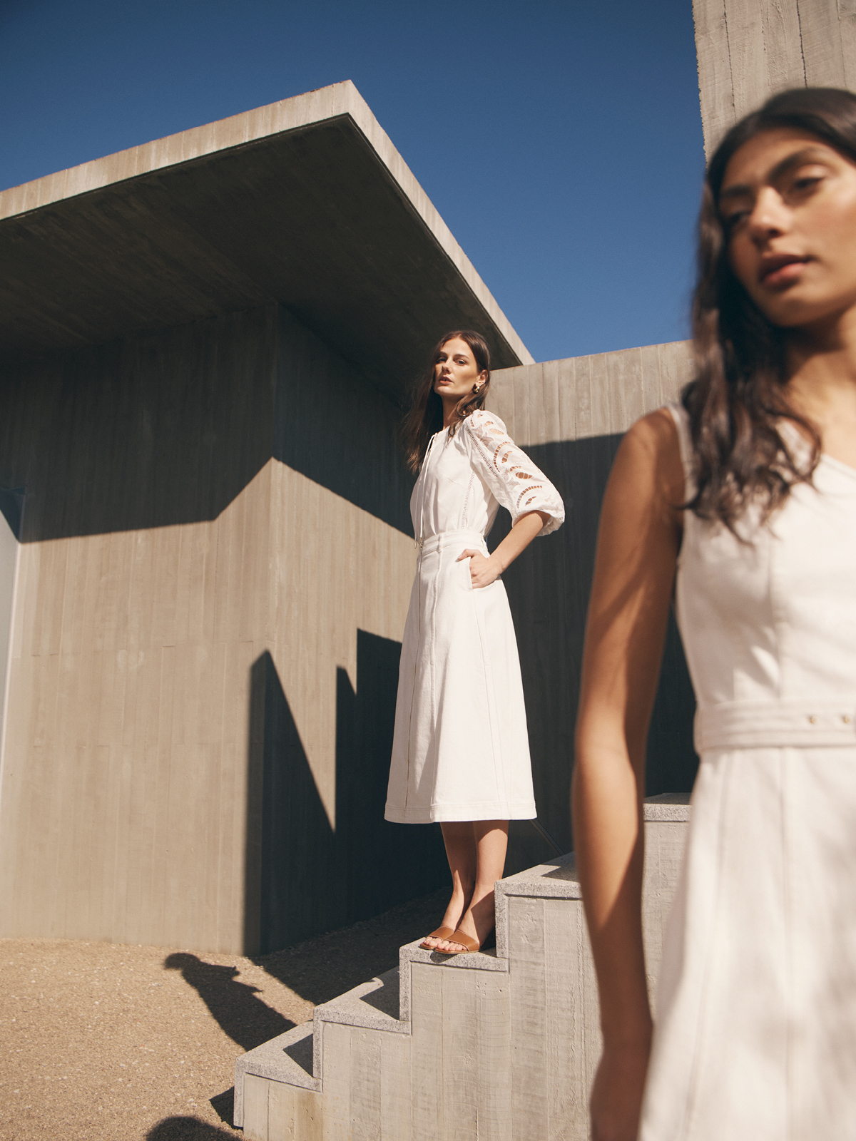
Ortolan was engaged to reposition and modernise the much-loved Review brand within a busy fashion landscape, while remaining true to its feminine heritage. The rebrand encompassed all elements of the identity—logo, monogram, packaging, website—and the art direction of a launch campaign to signal a confident new direction for the brand.
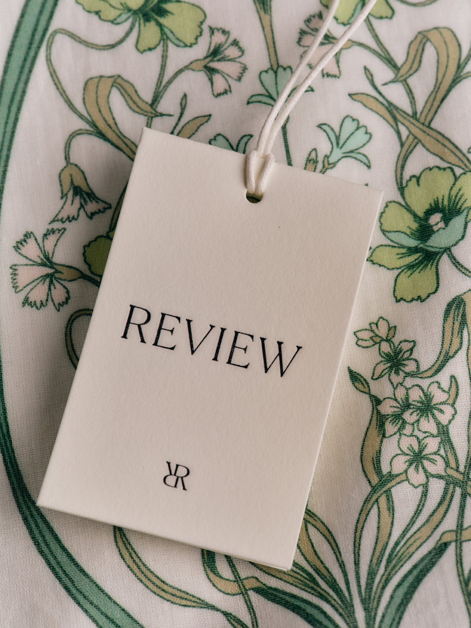

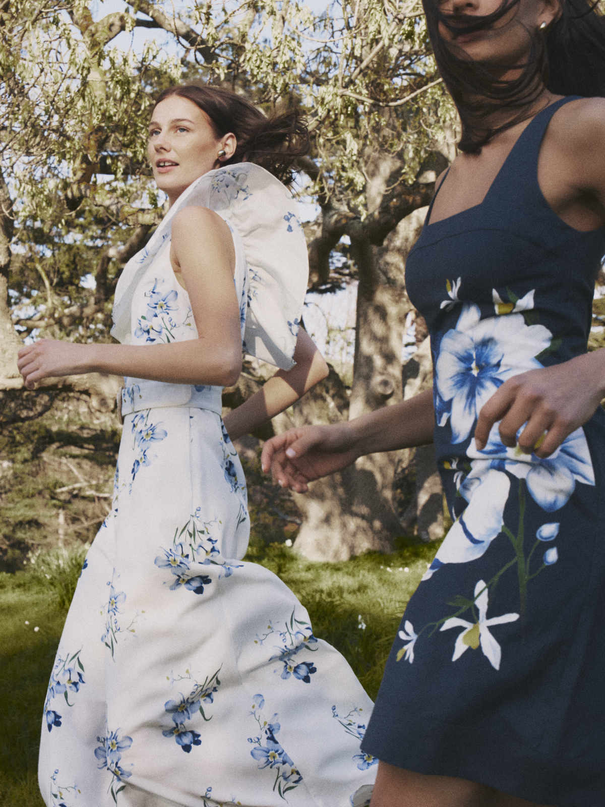
The new branding draws directly from Review’s signature prints, feminine silhouettes and intricate detailing—elements integral to the brand’s story. By looking deeply into the DNA of the business, we crafted an identity that feels authentic to its core values while offering a distinctive point of difference from competitors.