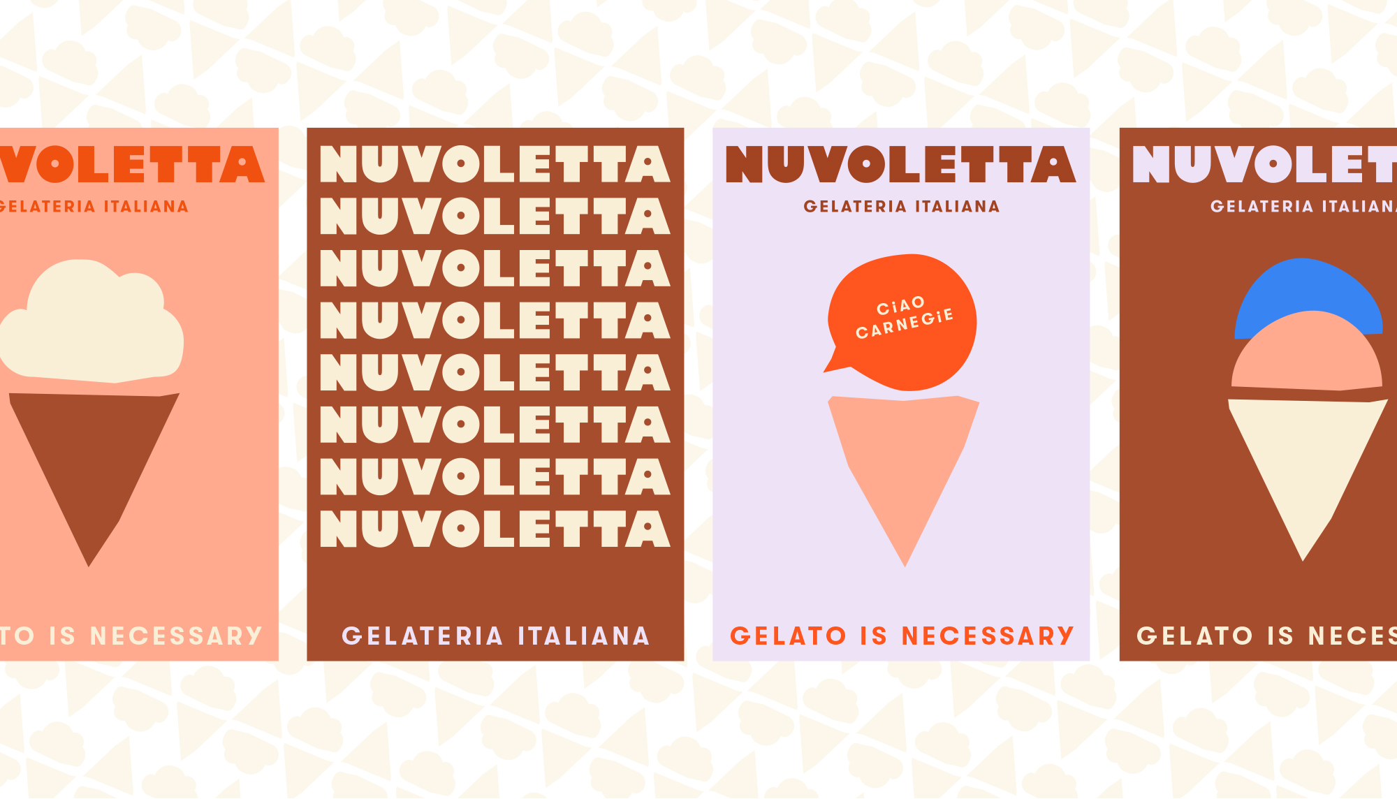
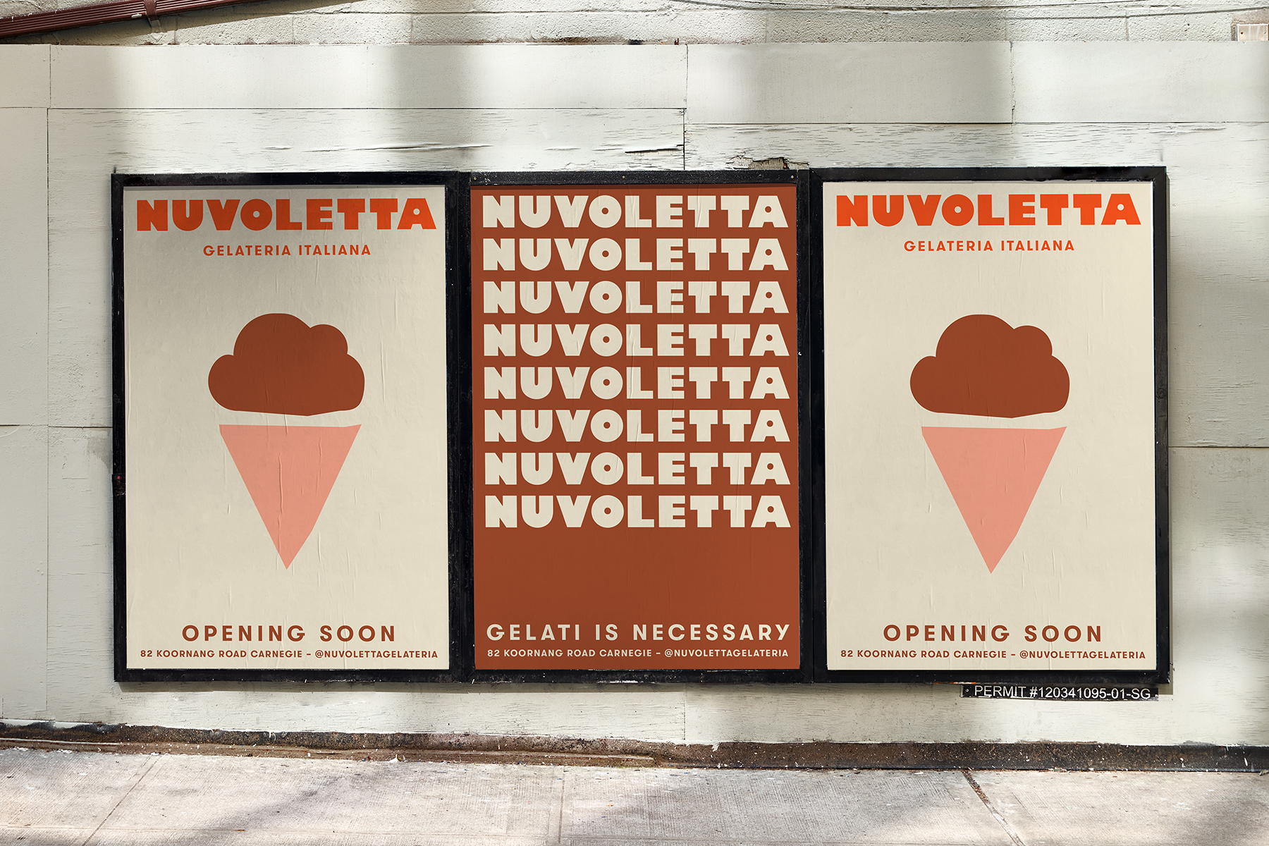
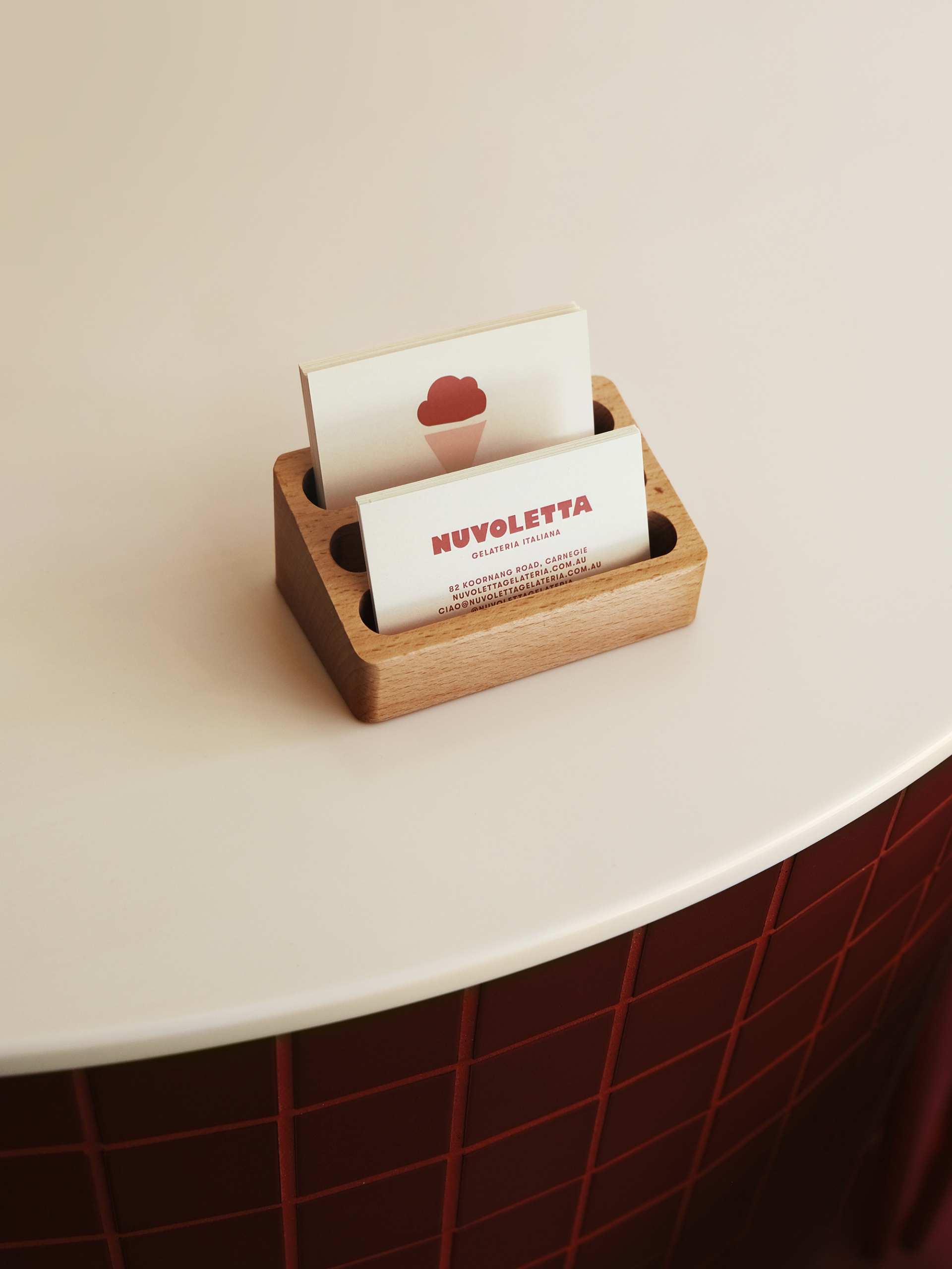
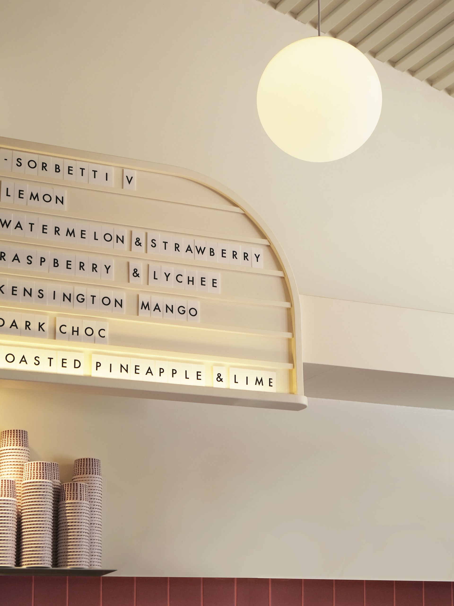
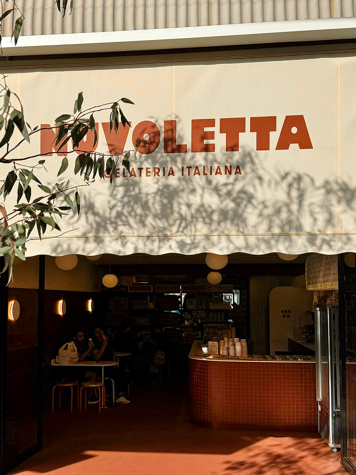
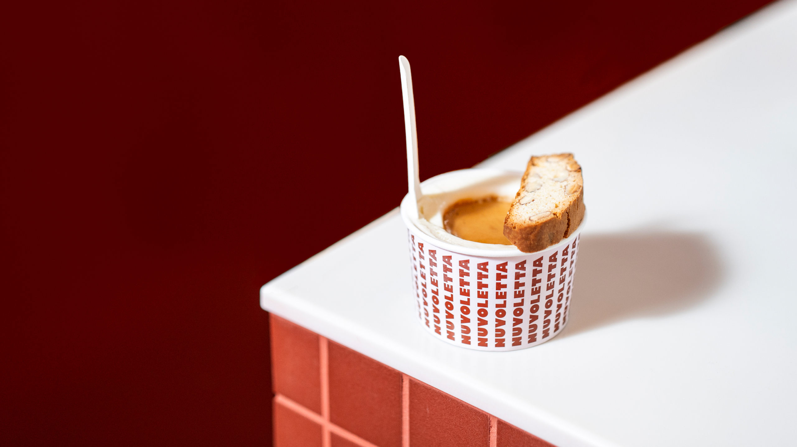
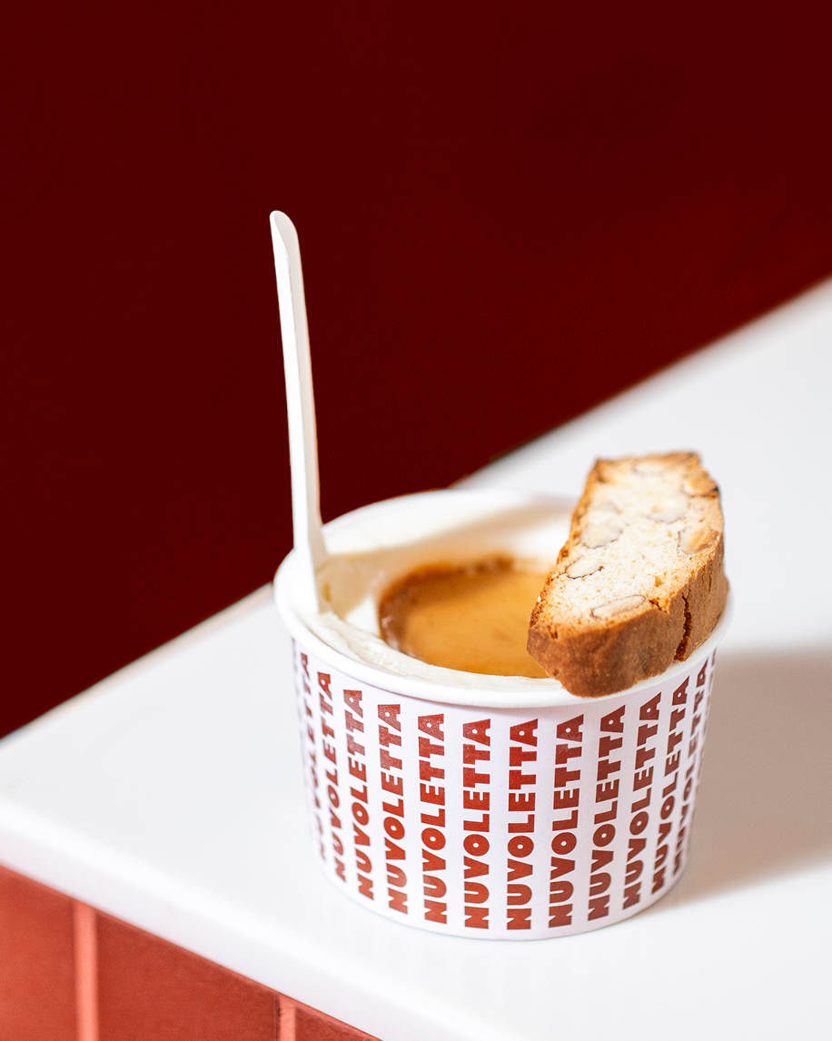
An identity inspired by 1970s Italian typography for an artisanal Italian gelateria that celebrates the magic and joy of gelato for children and grown-ups alike. An unexpected palette reflects the unique approach of the founders to ingredients.
Scope
- Brand Identity
- Brand Storytelling
- Copywriting
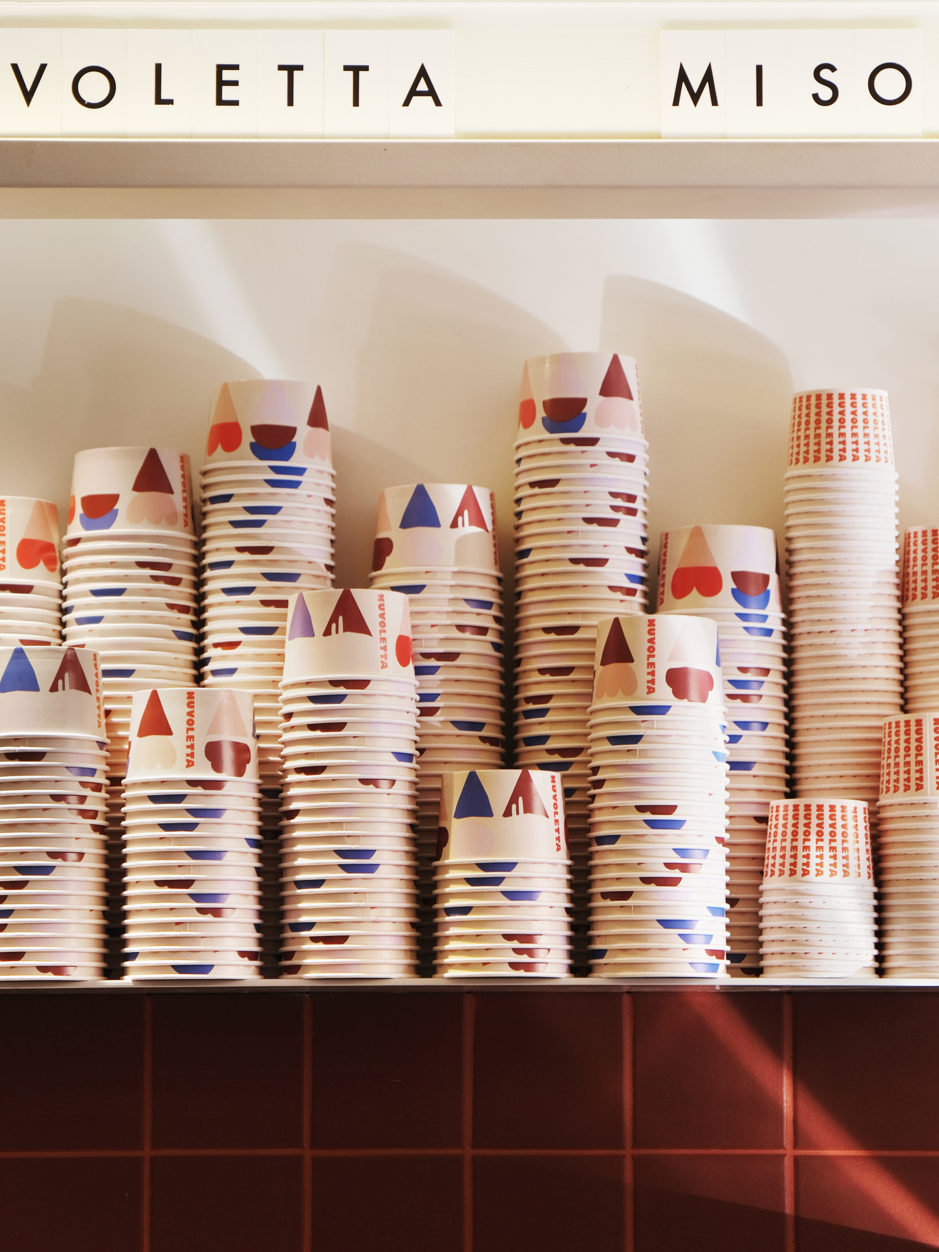
- Packaging
- Print & Outdoor
- Promotional
- Signage & Wayfinding
- Social Content & Ads
- Tone of Voice
After many years in the industry, this sweet-toothed duo set out to open a gelateria that celebrated the pure joy and magic of gelato — a brand that felt both grown-up and playful, welcoming gelato-lovers of all ages. In Melbourne’s competitive gelato landscape, distinctiveness was essential. We developed a characterful identity with a strong logo, unique colour palette and recognisable graphic toolkit, designed to flex across signage, packaging and store environments, supporting their expansion into new locations.
We crafted a suite of illustrations and developed a customised typeface for the Nuvoletta logo, drawing inspiration from expressive letterforms found in 1970s Italian typography. This gave the brand a nostalgic warmth with a contemporary edge.
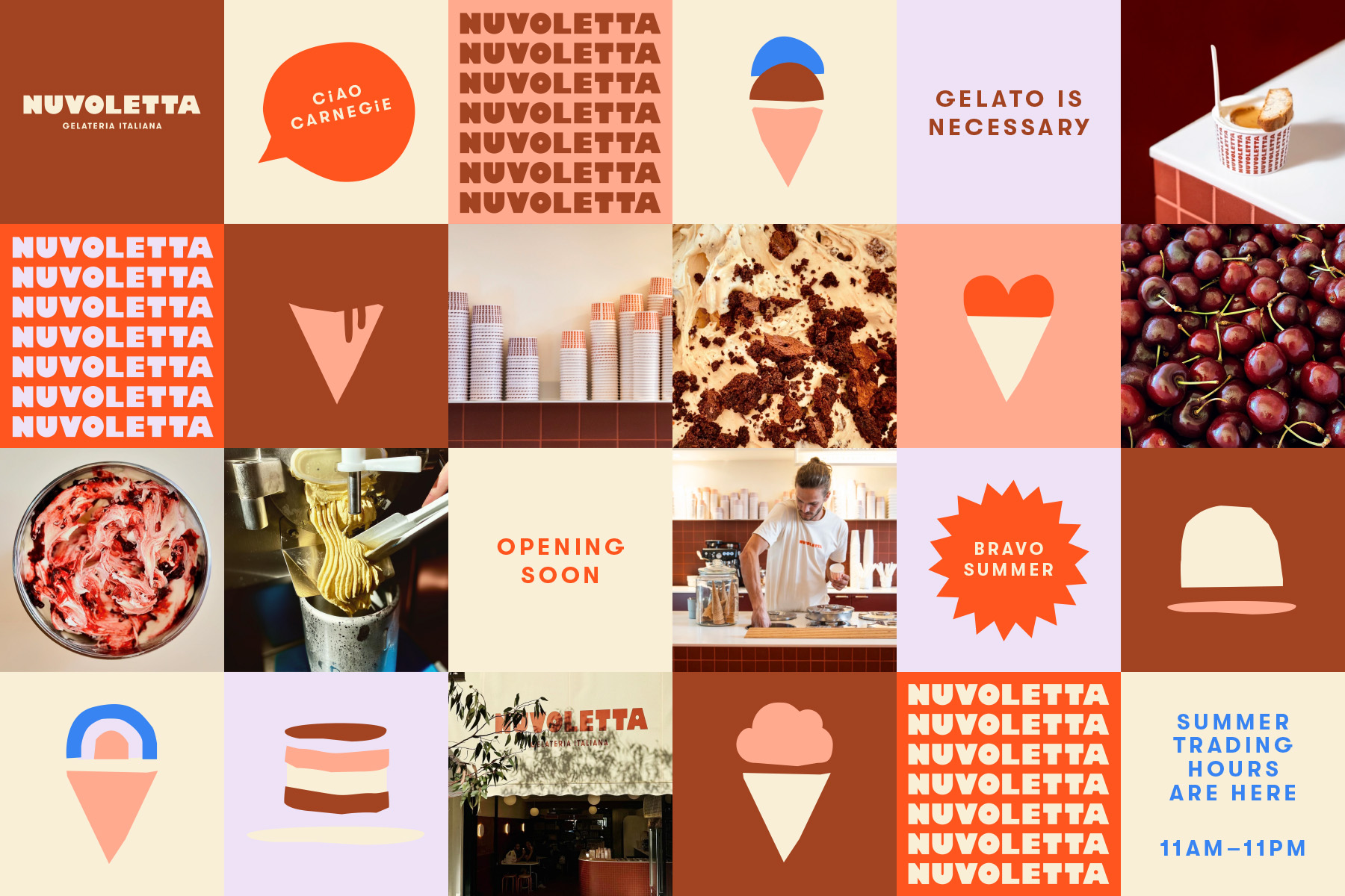
The colour palette was designed for maximum impact — a pastel foundation contrasted with deeper tones inspired by burnt caramel and blood orange, creating a rich and memorable visual language that stands out in the gelato world.
