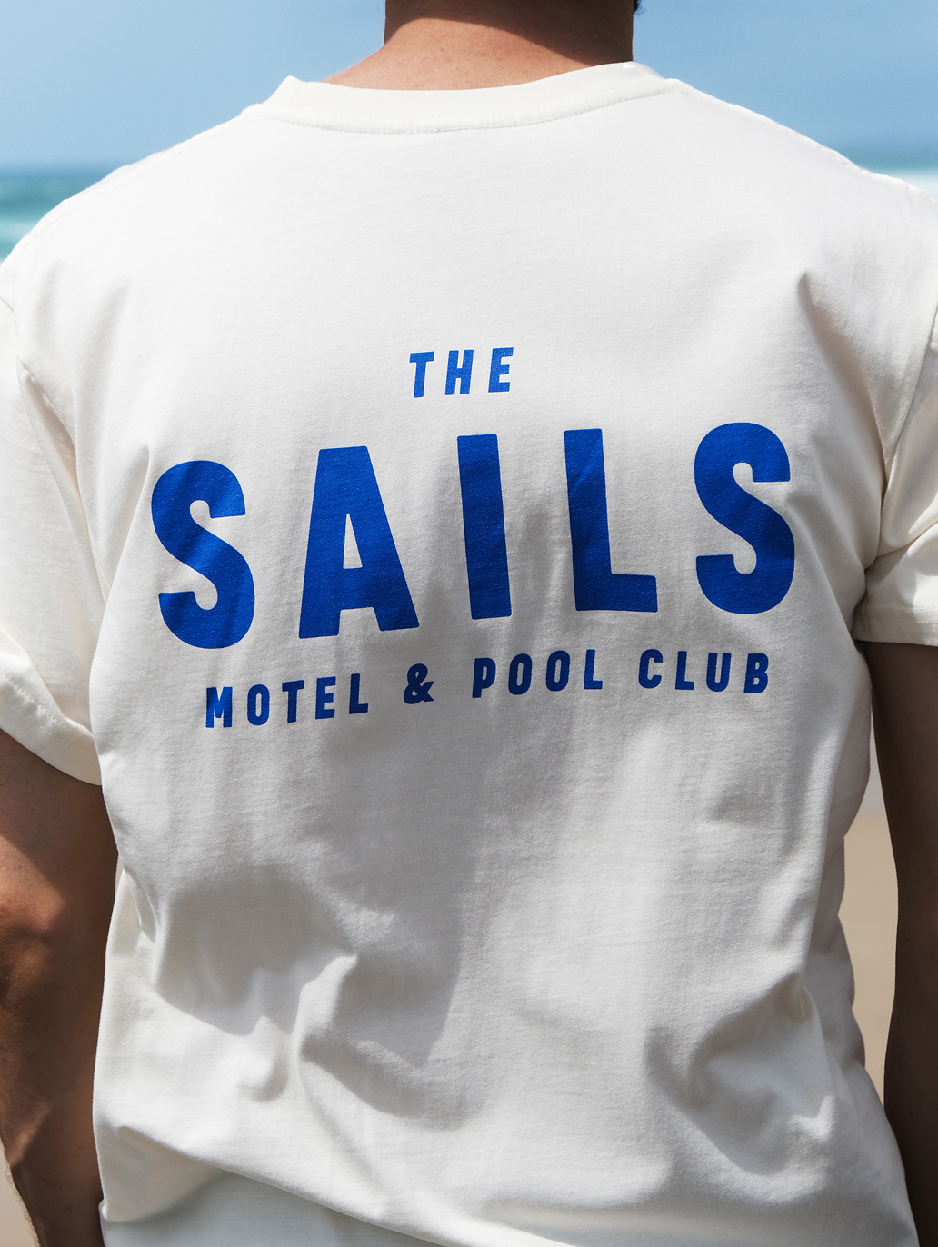
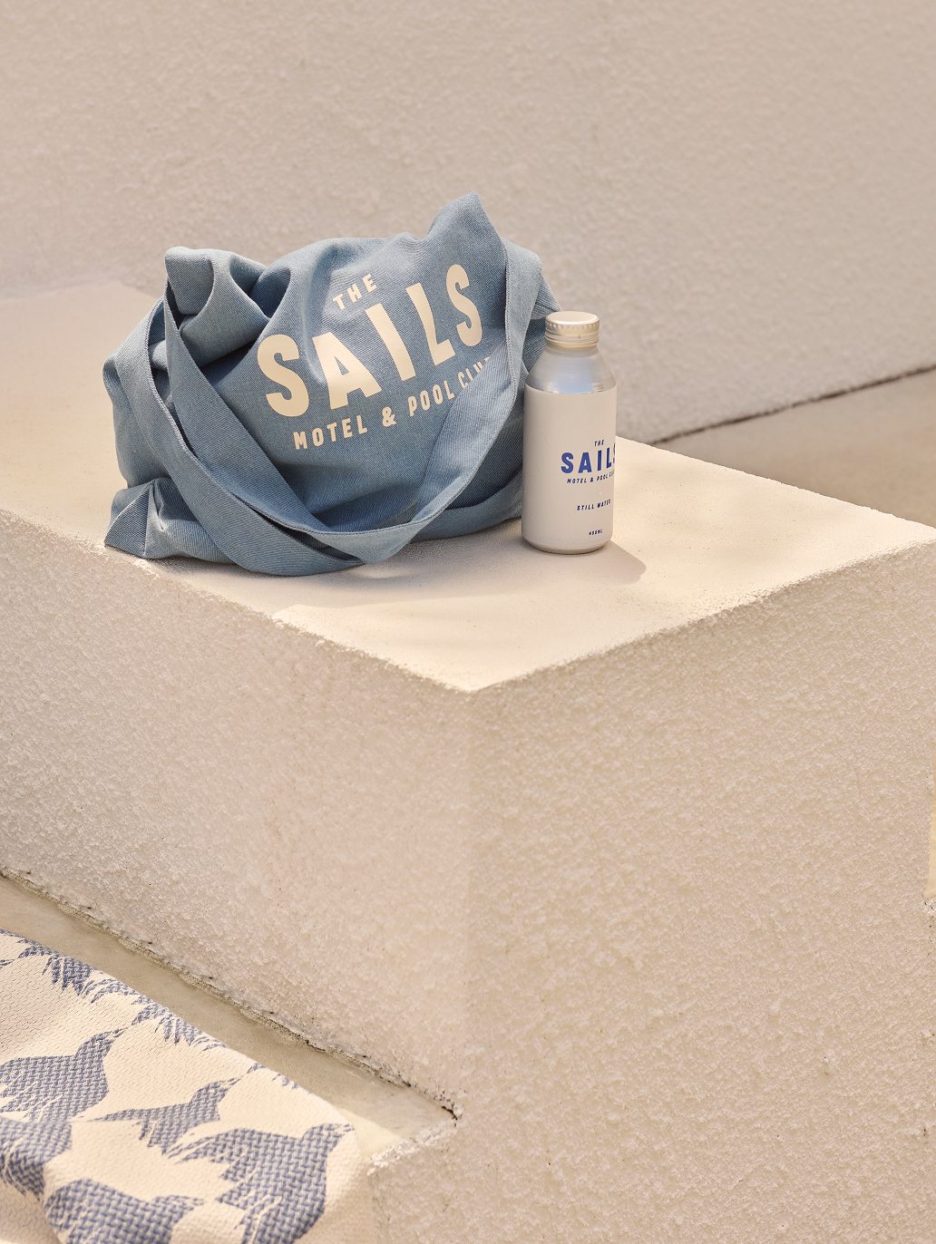
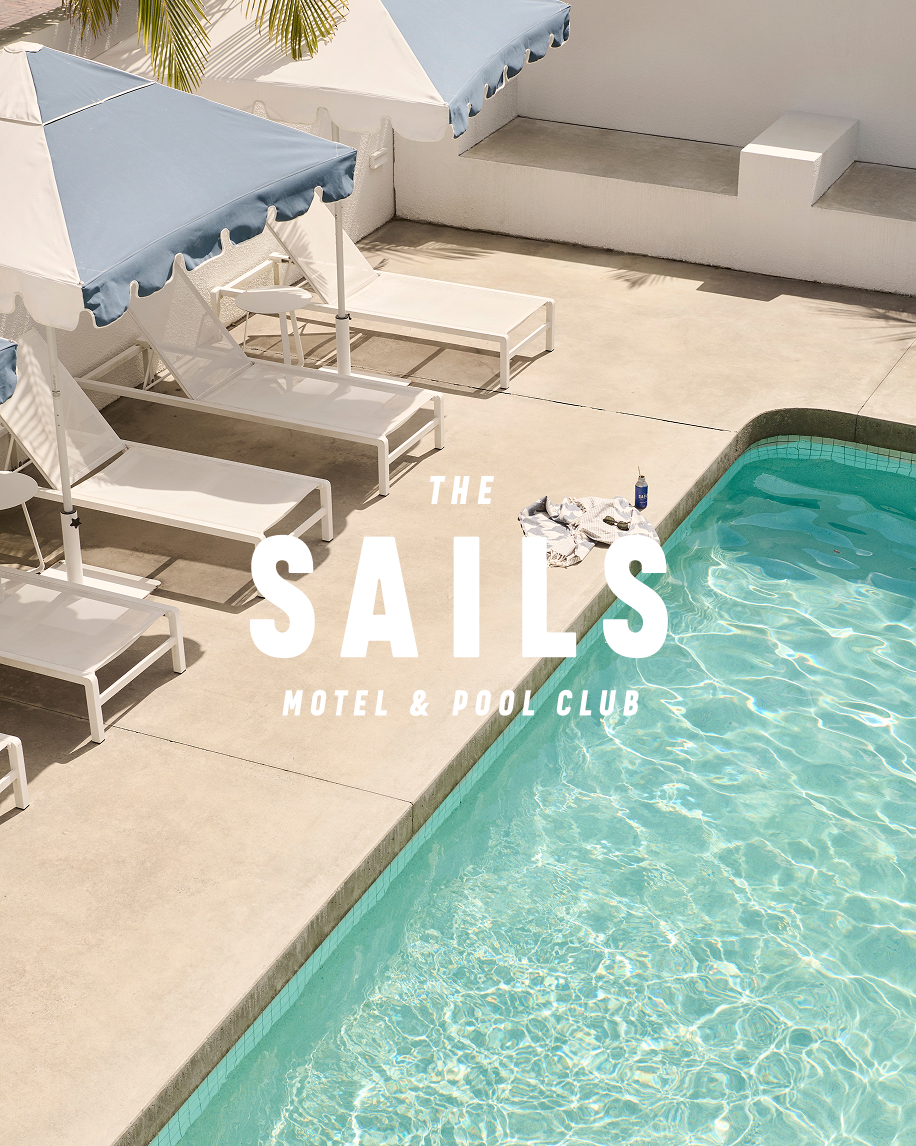
The Sails brand refresh was part of the refurbishment that elevated the brand while preserving the unique charm and simplicity that defines The Sails. Less was more to capture the feeling of classic, laidback Australian motel holidays.

Scope
- Brand Identity
- Brand Art Direction
- Brand Storytelling
- Promotional
- Signage & Wayfinding
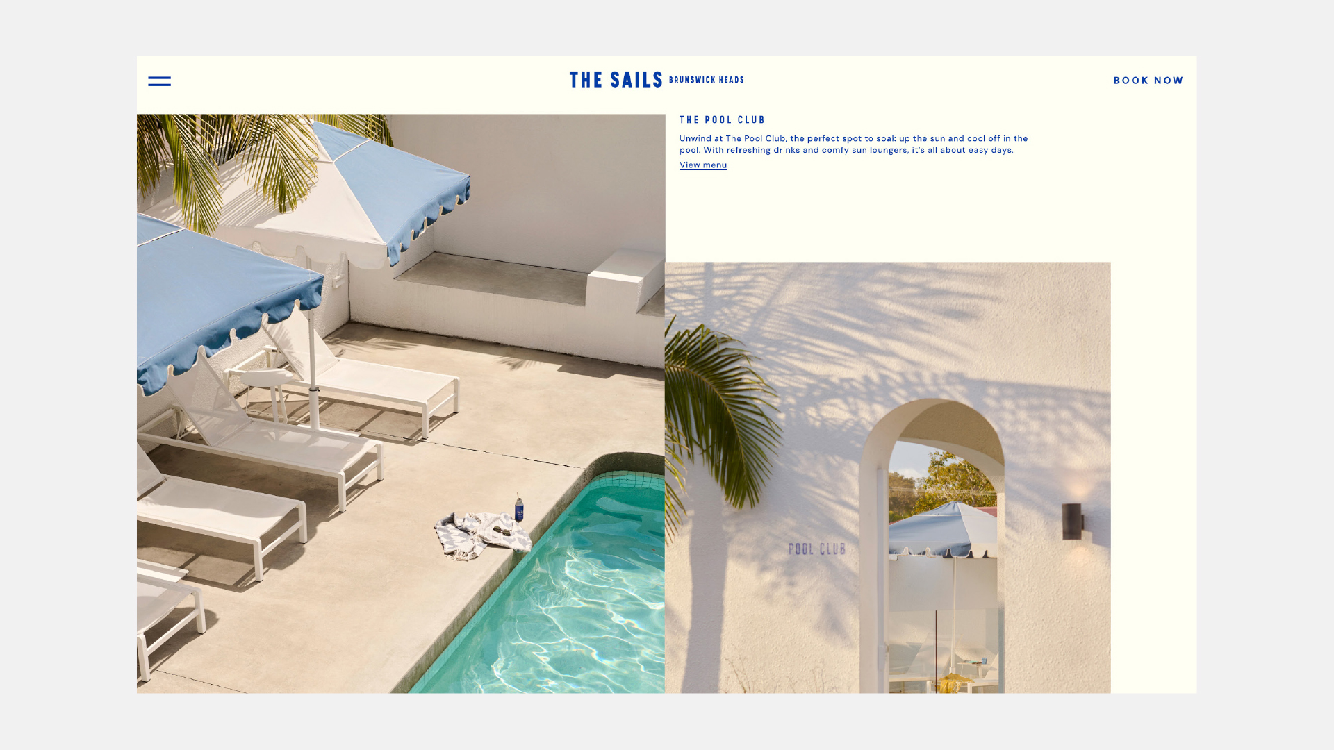
- Website UI & UX
Credits
- Photography by Eve Wilson
- Room photography Jonny Valiant
- Website build by Creative Friend
Undertaken in collaboration with our long-term partners at Laminex, the motel refurbishment was captured in a film by The Local Project, as we led a brand refresh and developed a new website to reintroduce The Sails to a new generation of travellers.

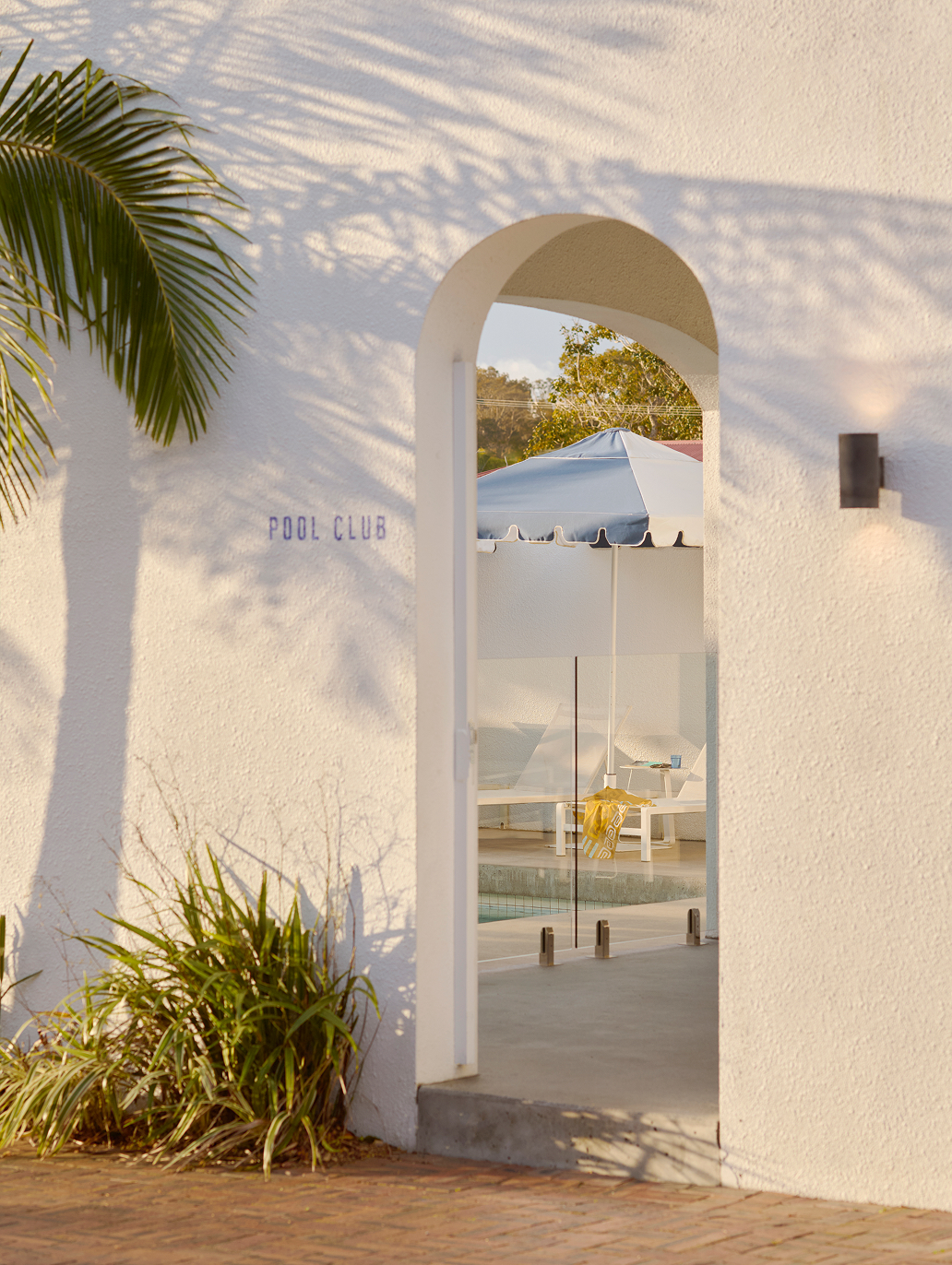
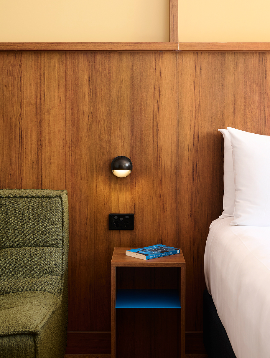
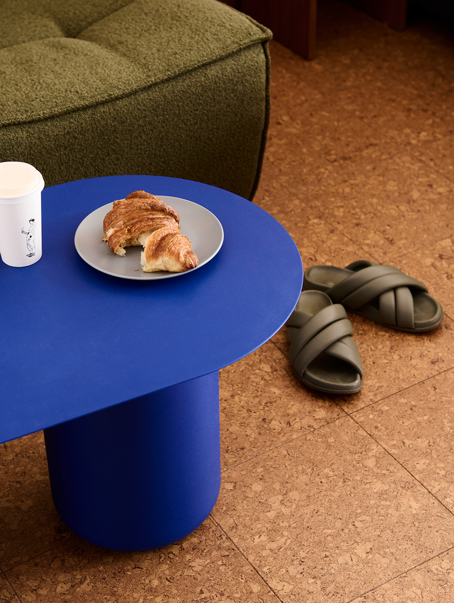
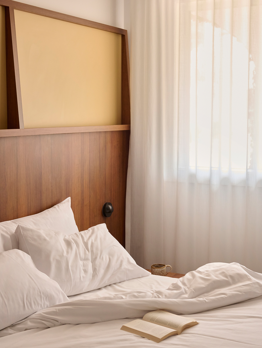
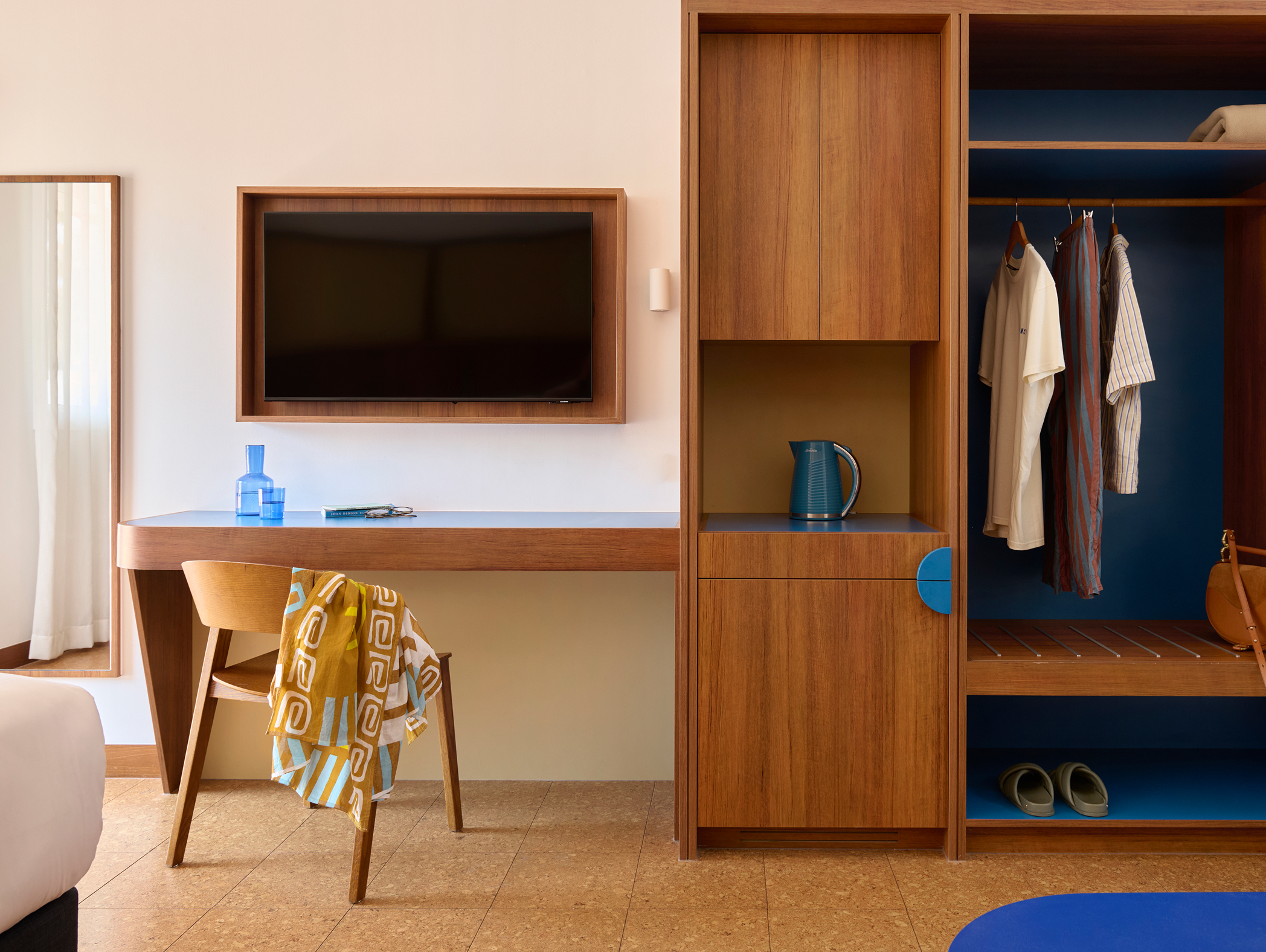
Working closely with the owners, we elevated the brand while preserving the unique charm and simplicity that defines The Sails. To capture the feeling of classic, laidback Australian holidays, we paired a warm base palette with bold cobalt blue—reflective of the sand, sea and expansive coastal sky.

The typography draws on mid-century European coastal hotel signage, evoking the spirit of travel and the timeless character of Riviera-style motels. Combining italic and regular styles, the stepped-out typographic treatment is informed by the motel’s original vertical sign, which remains an iconic feature of the site.