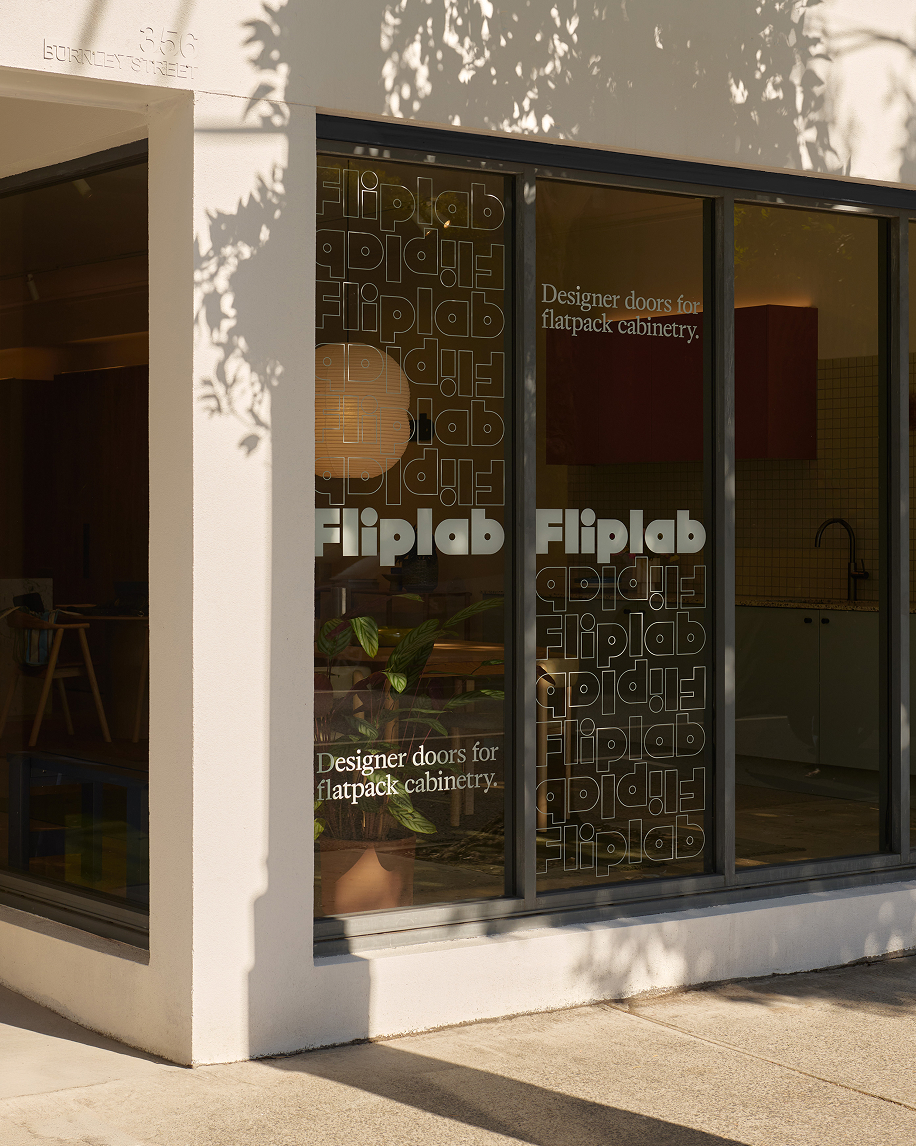
Fliplab
Elevating the flatpack experience
Harrison
Telling a story of heritage
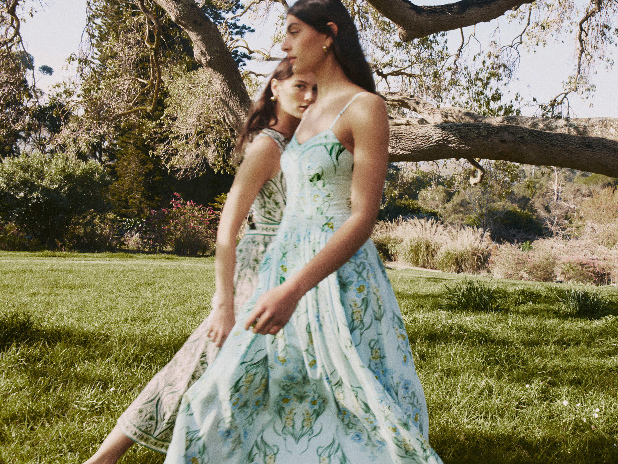
Review
Modernising femininity
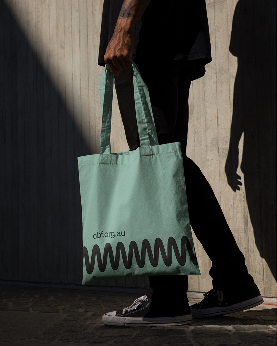
Community Broadcasting Foundation
Giving voice to community
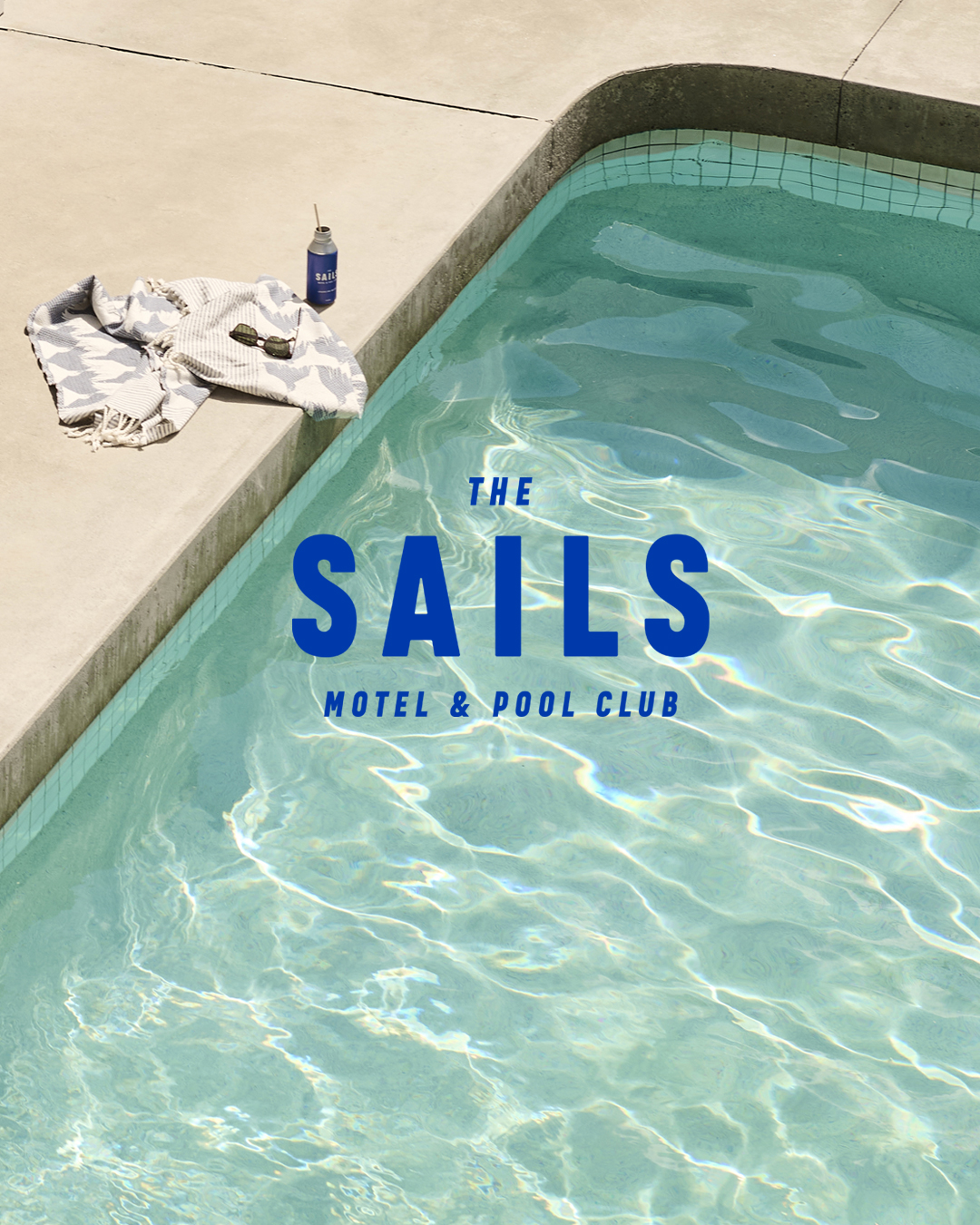
The Sails
Preserving an authentic charm
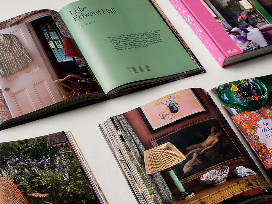
Thames & Hudson
This Creative Life
Shoes & Sox
Empowering individuality
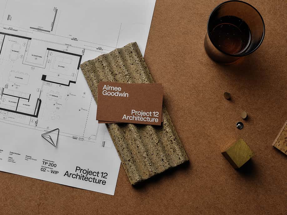
Project 12 Architecture
An identity inspired by collaboration
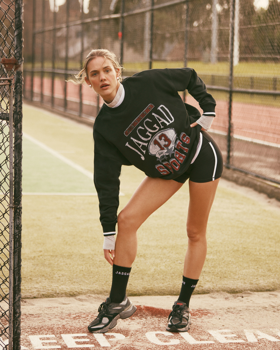
Jaggad
Elevating activewear
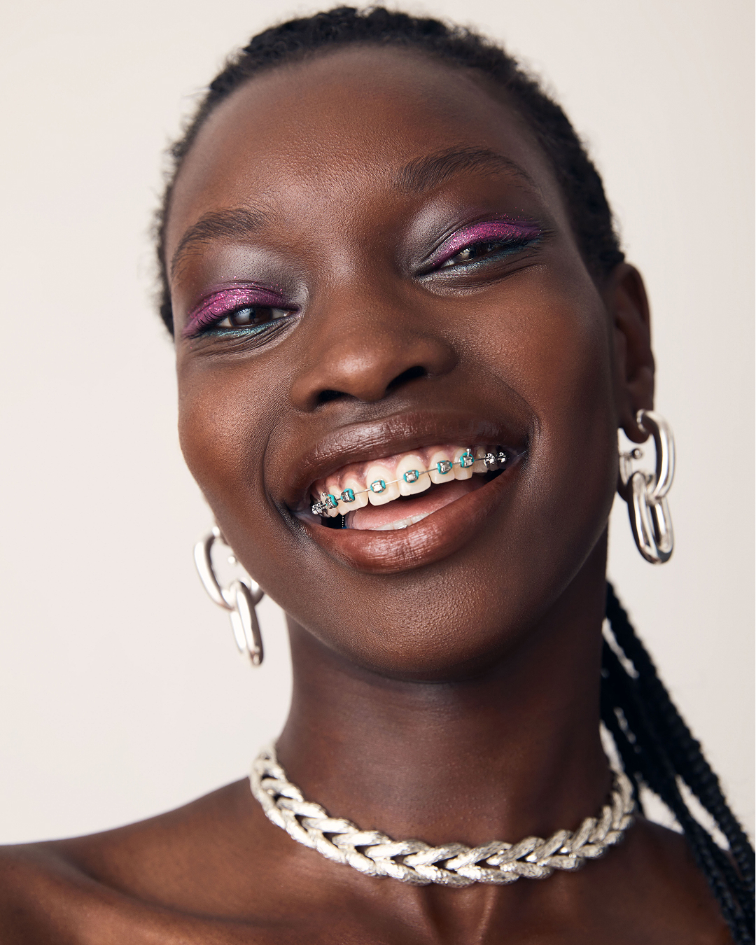
Homeroom
A fashion directory for modern Australia
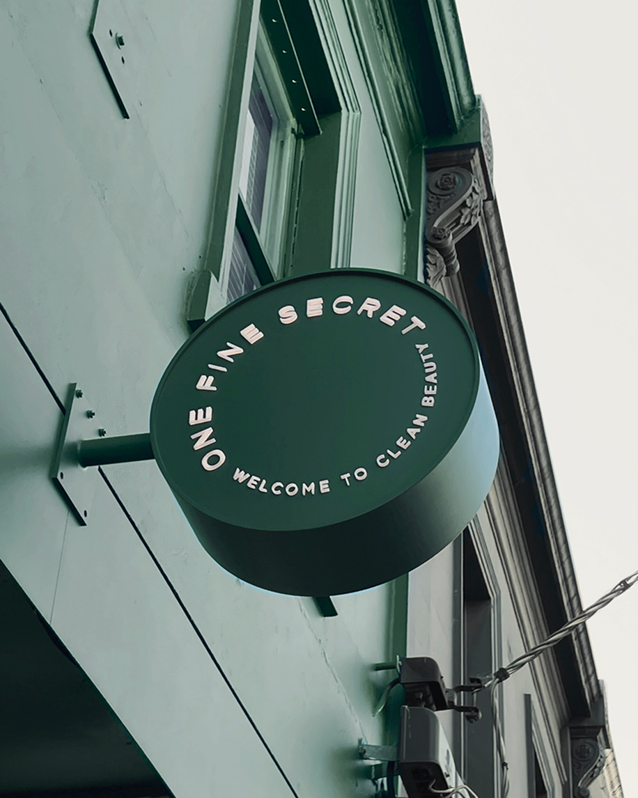
One Fine Secret
A clean-beauty overhaul
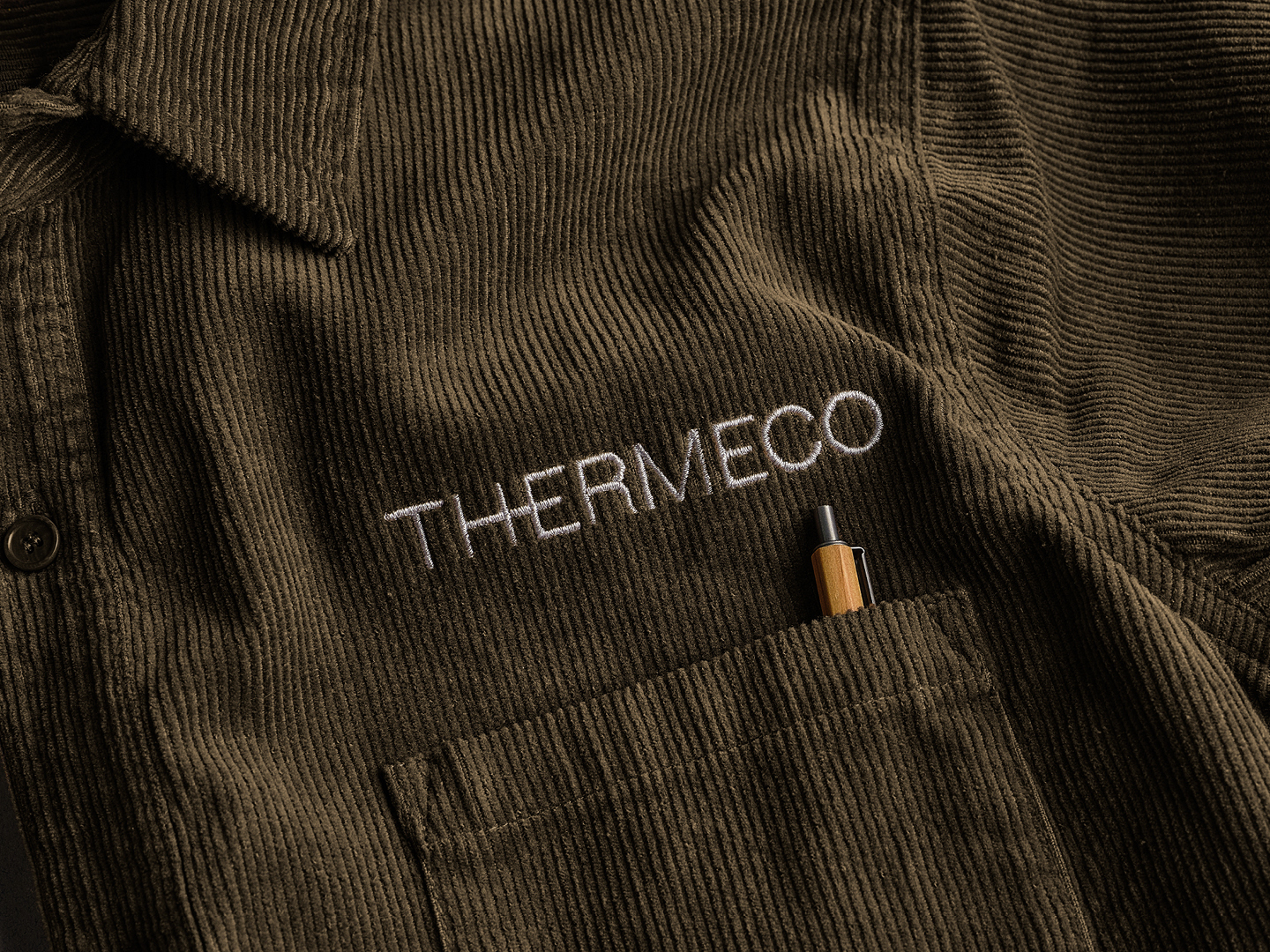
Thermeco
Confidence through restraint
Laminex
Continued creative partnerships
Typecast Entertainment
Championing First Nation storytelling

Mastani
Building brand story through campaign
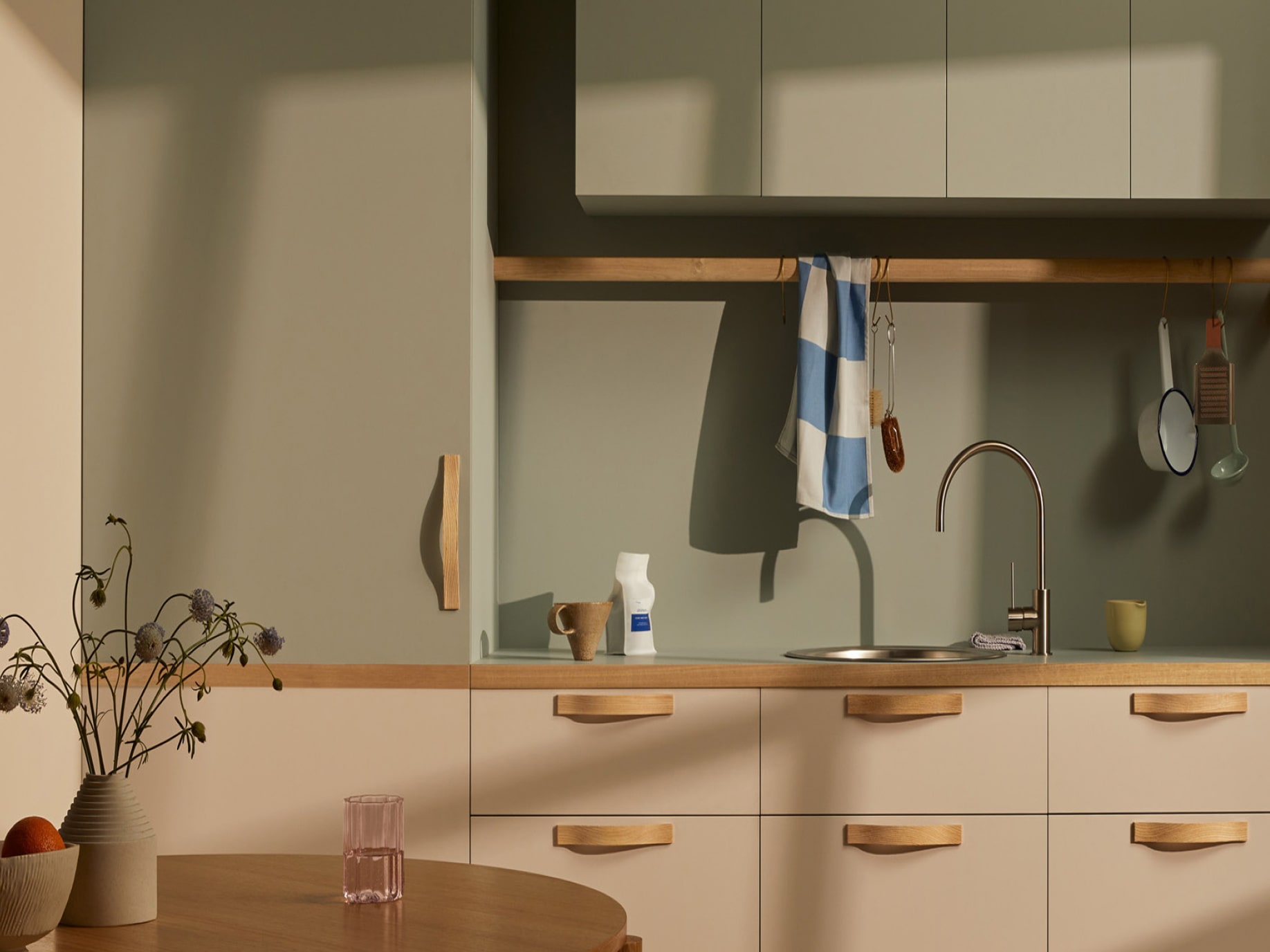
Laminex
Reimagining an iconic surface
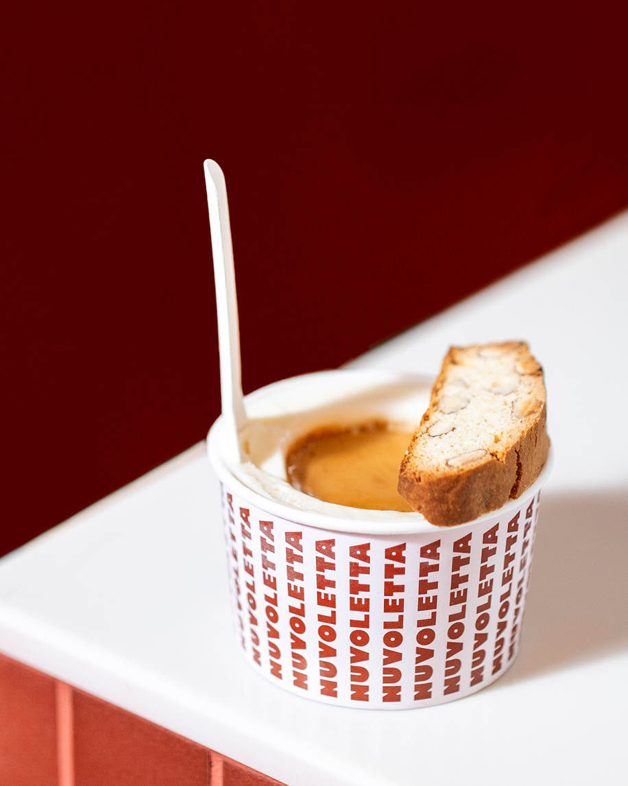
Nuvoletta
The joy of gelato
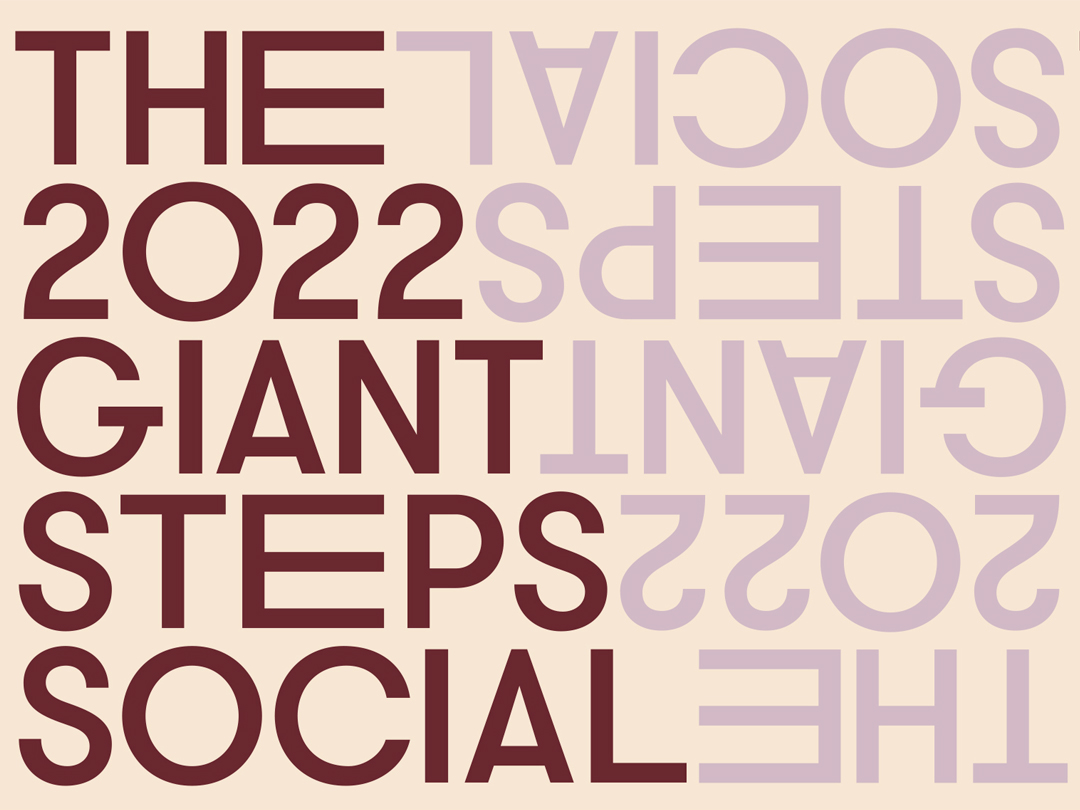
Giant Steps
Design to celebrate and empower communities
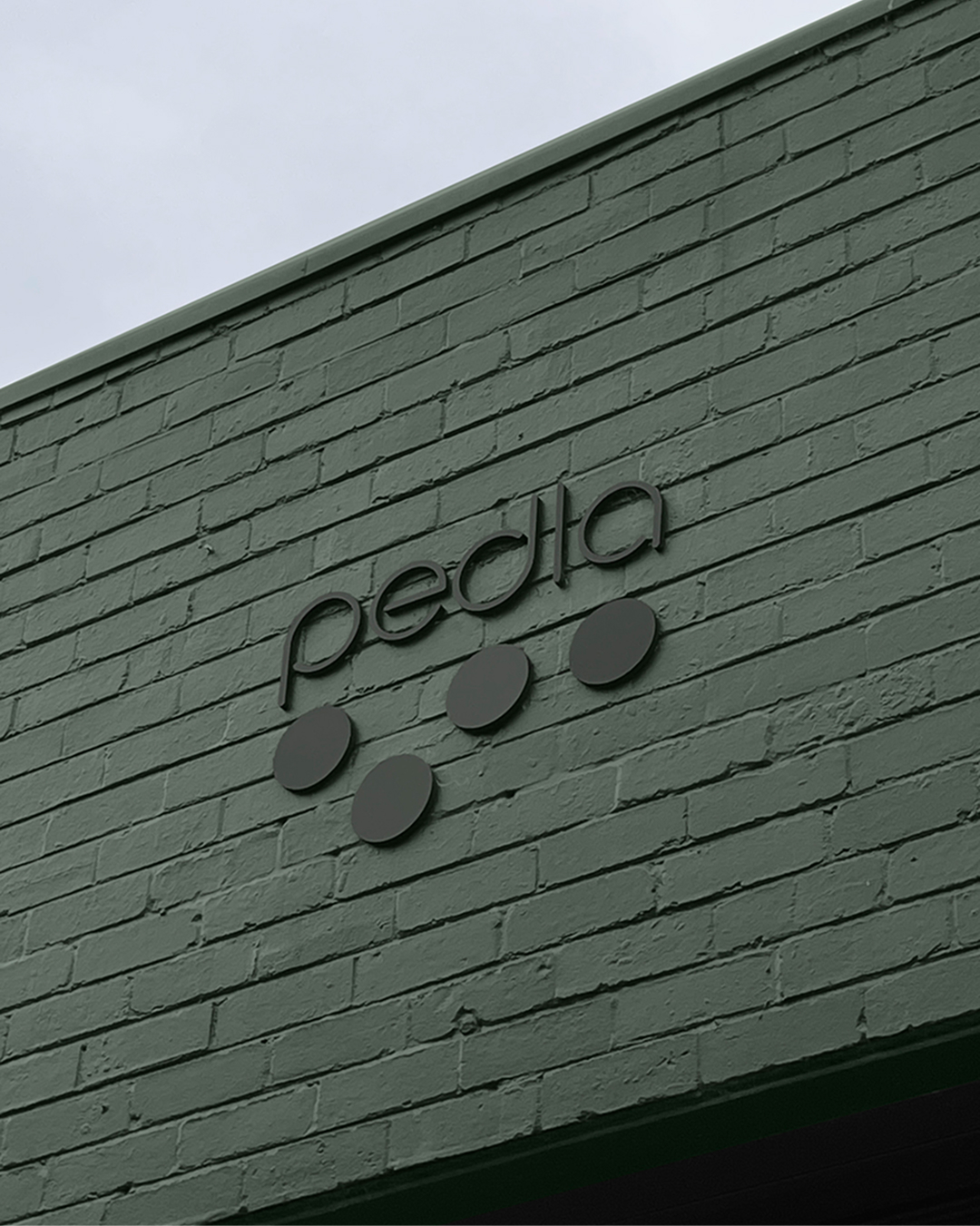
Pedla
Modernising a cult cycling brand

Ella Baché
Individual skin stories
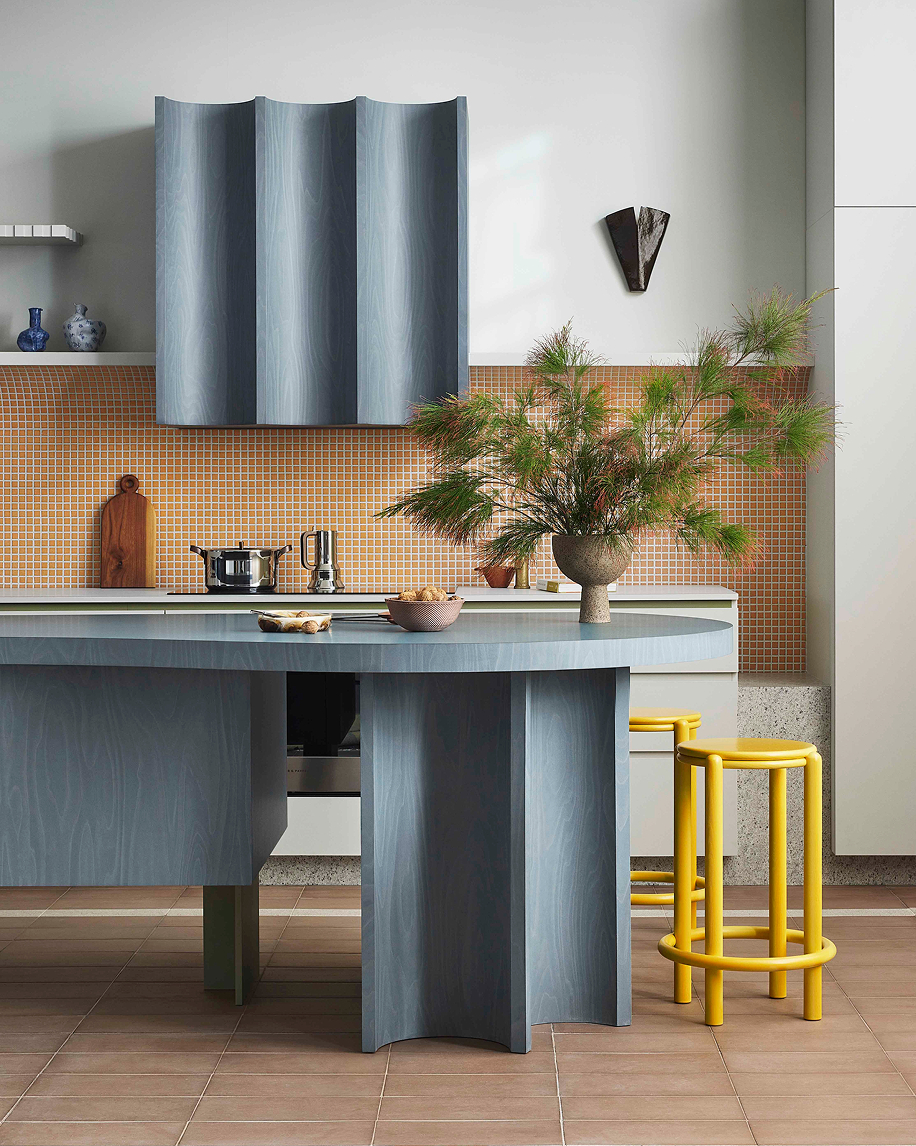
Laminex
A masterclass in colour and texture
Surround by Laminex
A different way to do walls
James Hardie
A strategic campaign for enduring impact

Dotti
A fashion democracy
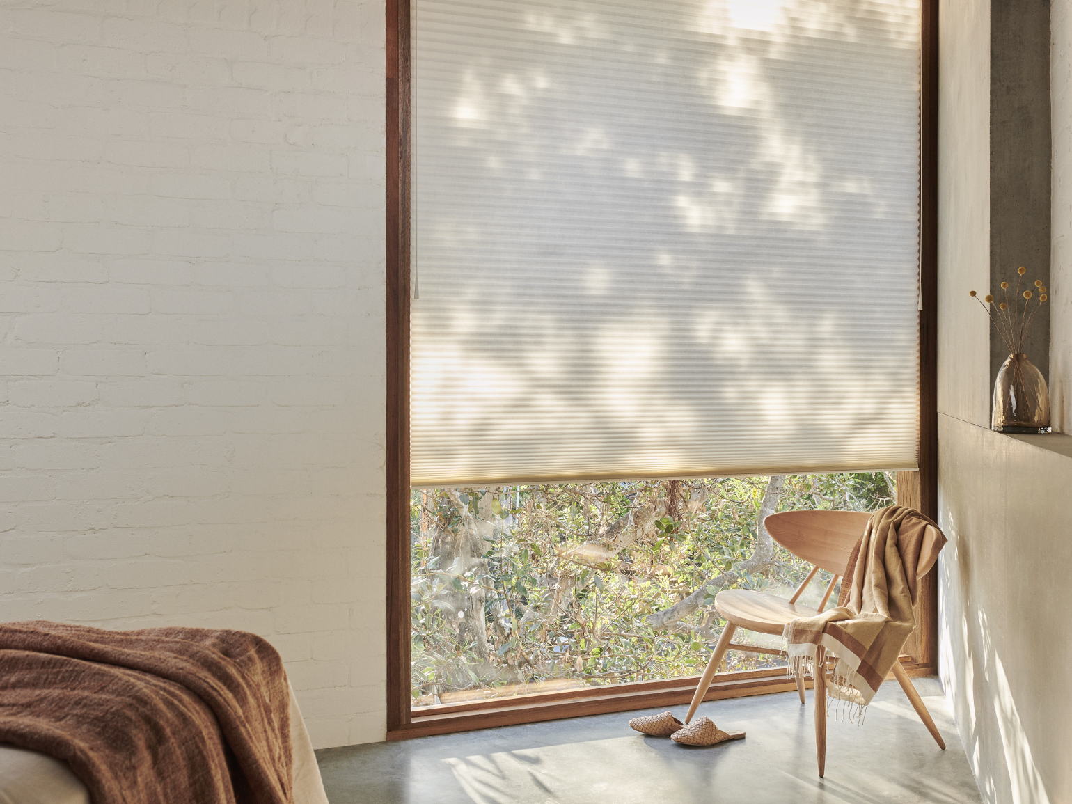
Luxaflex
A brand partnership to elevate an icon

Yarra Trail
Returning a brand to its roots
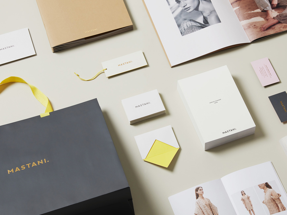
Mastani
Branding the intersection of tradition and modernity

Connor
Aligning brand personality with creative

Liberty Belle
Beauty meets science
Mimi Haircare for Kids
Playful self-care for kids

Laminex
A human manufacturing story
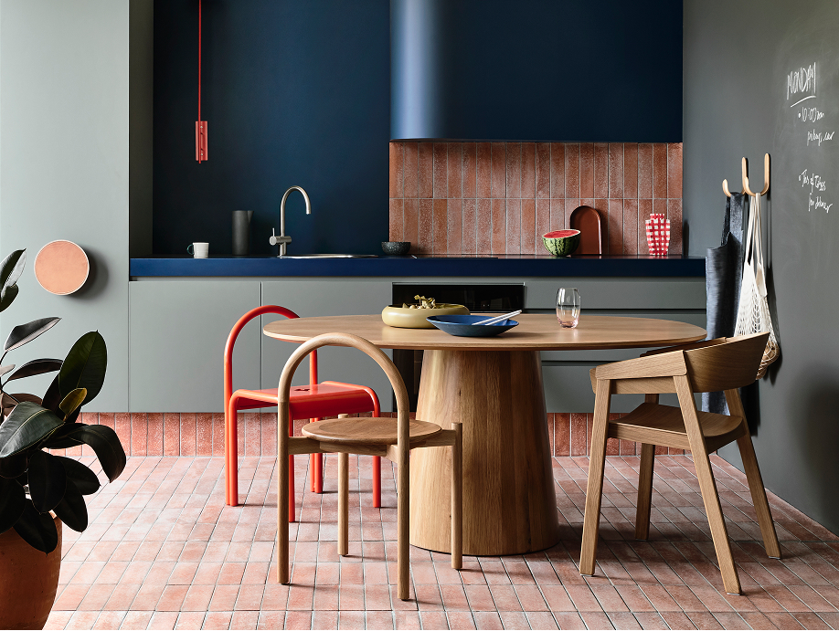
Laminex
Elevating through creative collaboration
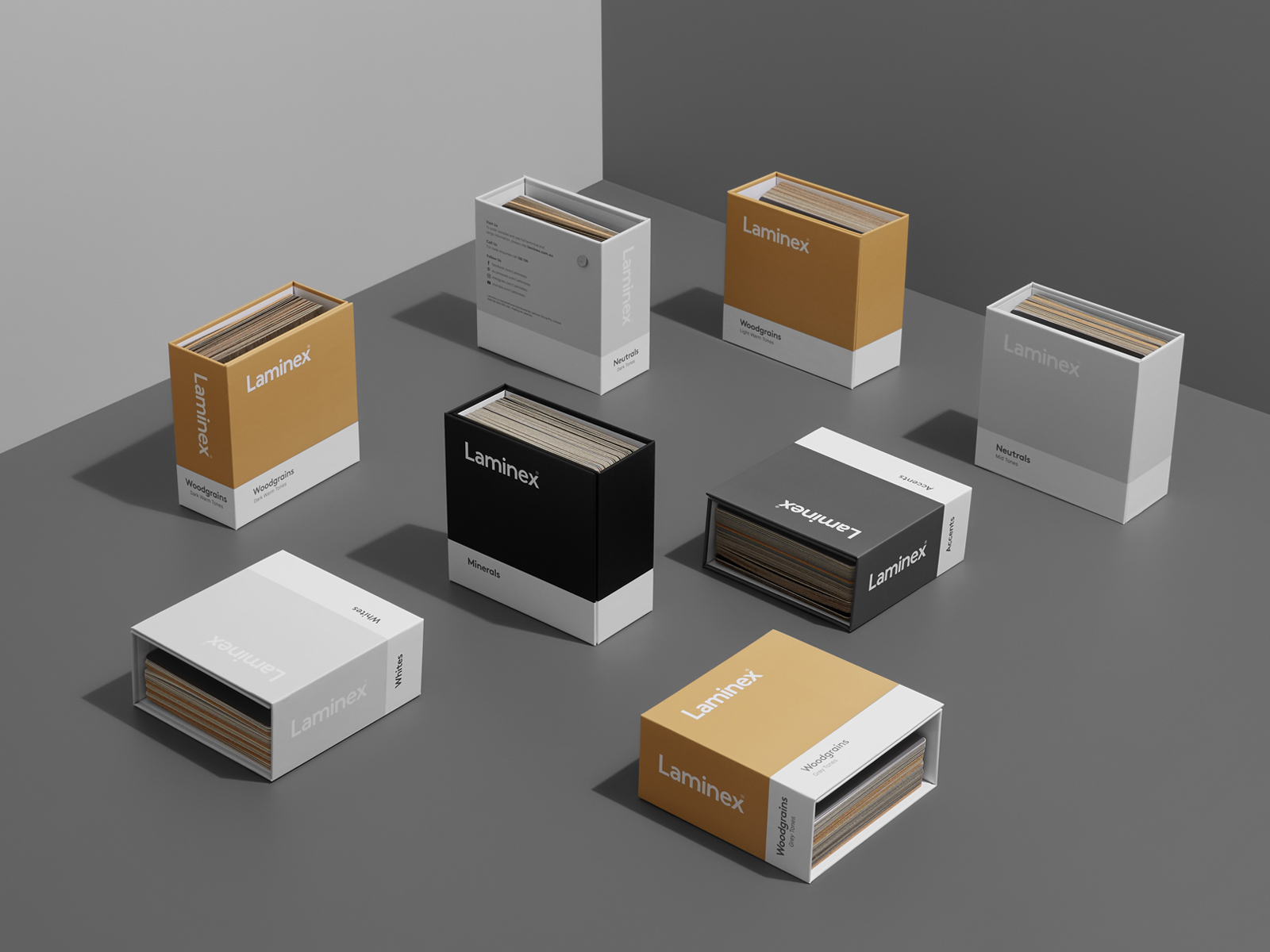
Laminex
From trade to design