As ROAM Architects continued to grow, the practice had evolved beyond the identity it had originally established. We worked with the team to reposition the brand around a clearer expression of who ROAM had become and where it wanted to go next.
Scope
- Brand Strategy
- Brand Art Direction
- Brand Guidelines
- Brand Identity
- Copywriting
- Film & Motion
- Full Service Production
- Signage & Wayfinding
- Stationery
- Tone of Voice
- Website UI & UX
Credits
- Photography & Motion by Micheal Pham
- Website build by Sam Morgan
- Sign fabrication by Anchor Signs
- Typeface by Lineto
- Print by Press Print
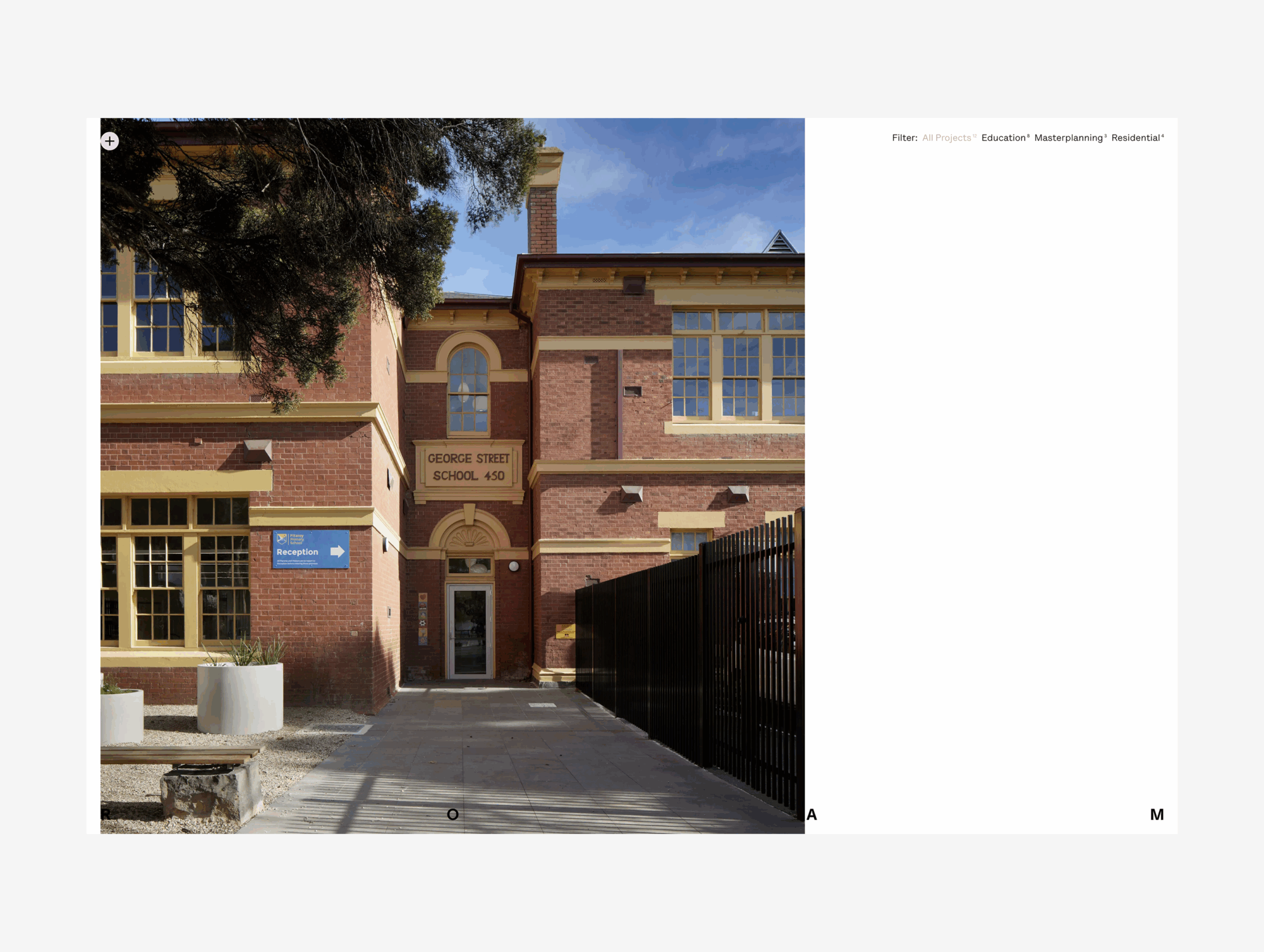
A new identity for ROAM Architects that reflects the people, curiosity and adaptability behind the practice, while creating a flexible system for the next stage of its growth. Through collaborative workshops, we explored ROAM’s ambitions, values, personality, purpose and vision for the future resulting in a robust Brand Strategy to guide their growth. At the centre was a simple belief: architecture should create thoughtful spaces to enrich everyday life. From this, we developed a brand that feels open, curious and human, while supporting ROAM’s ambition to grow into a practice recognised for thoughtful, playful and socially impactful architecture.
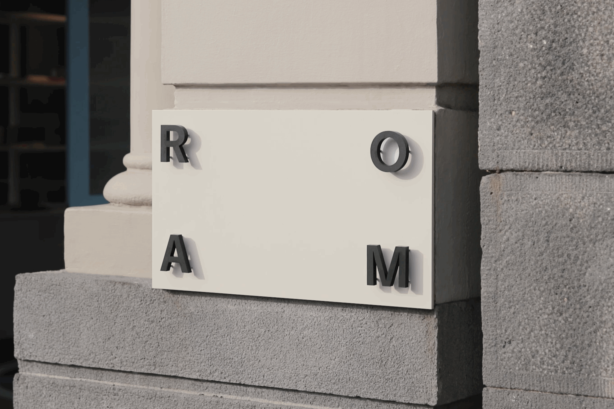
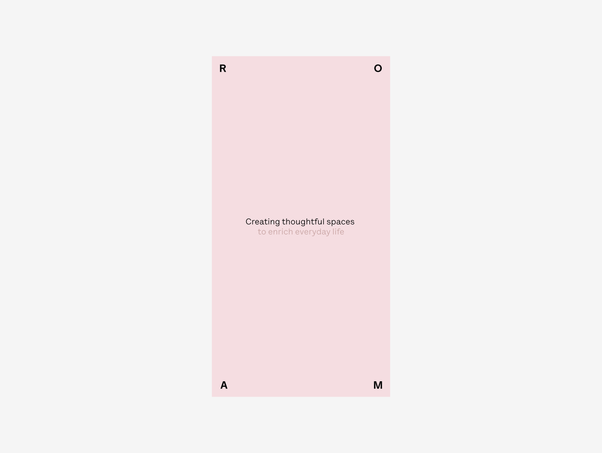
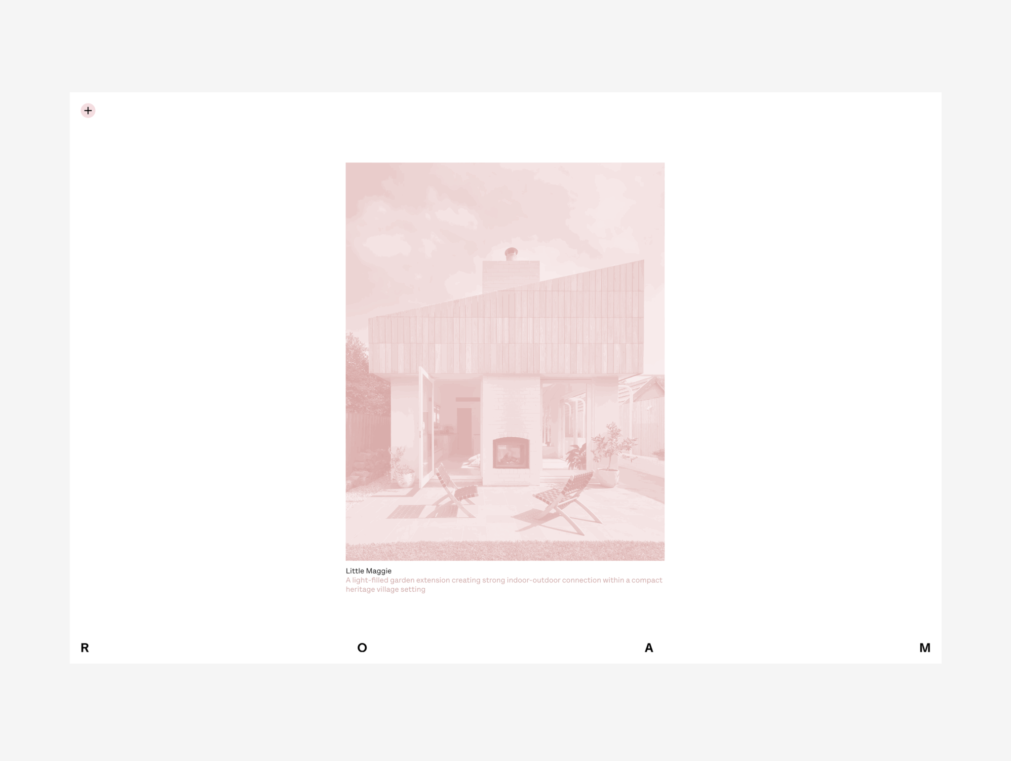
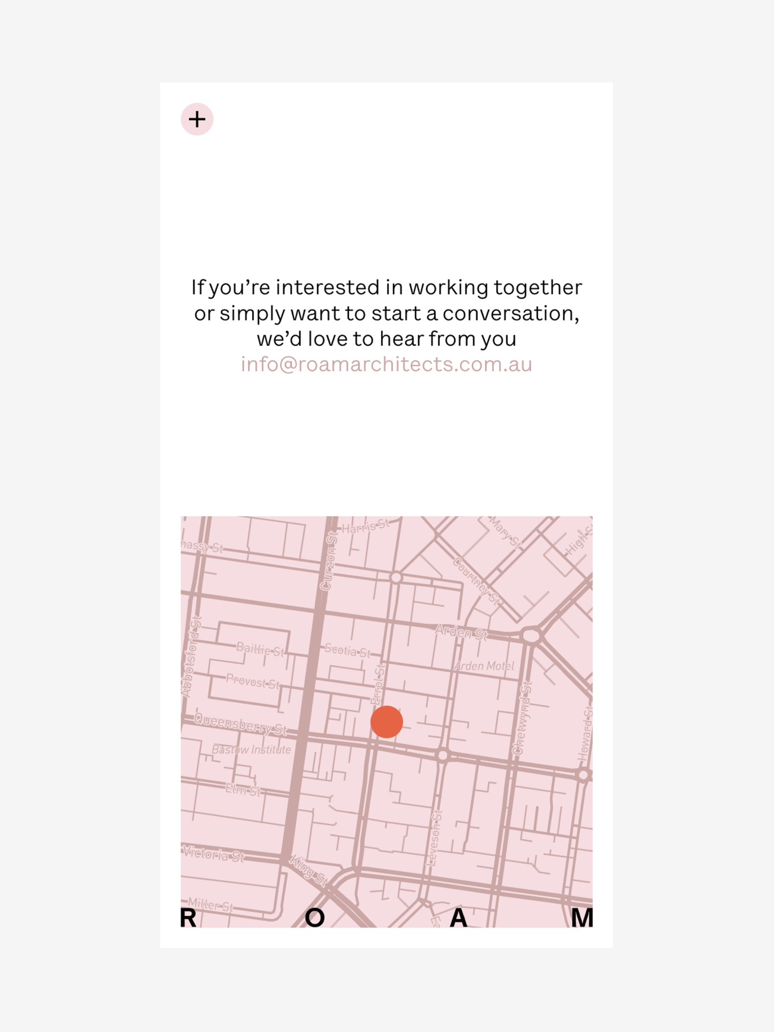
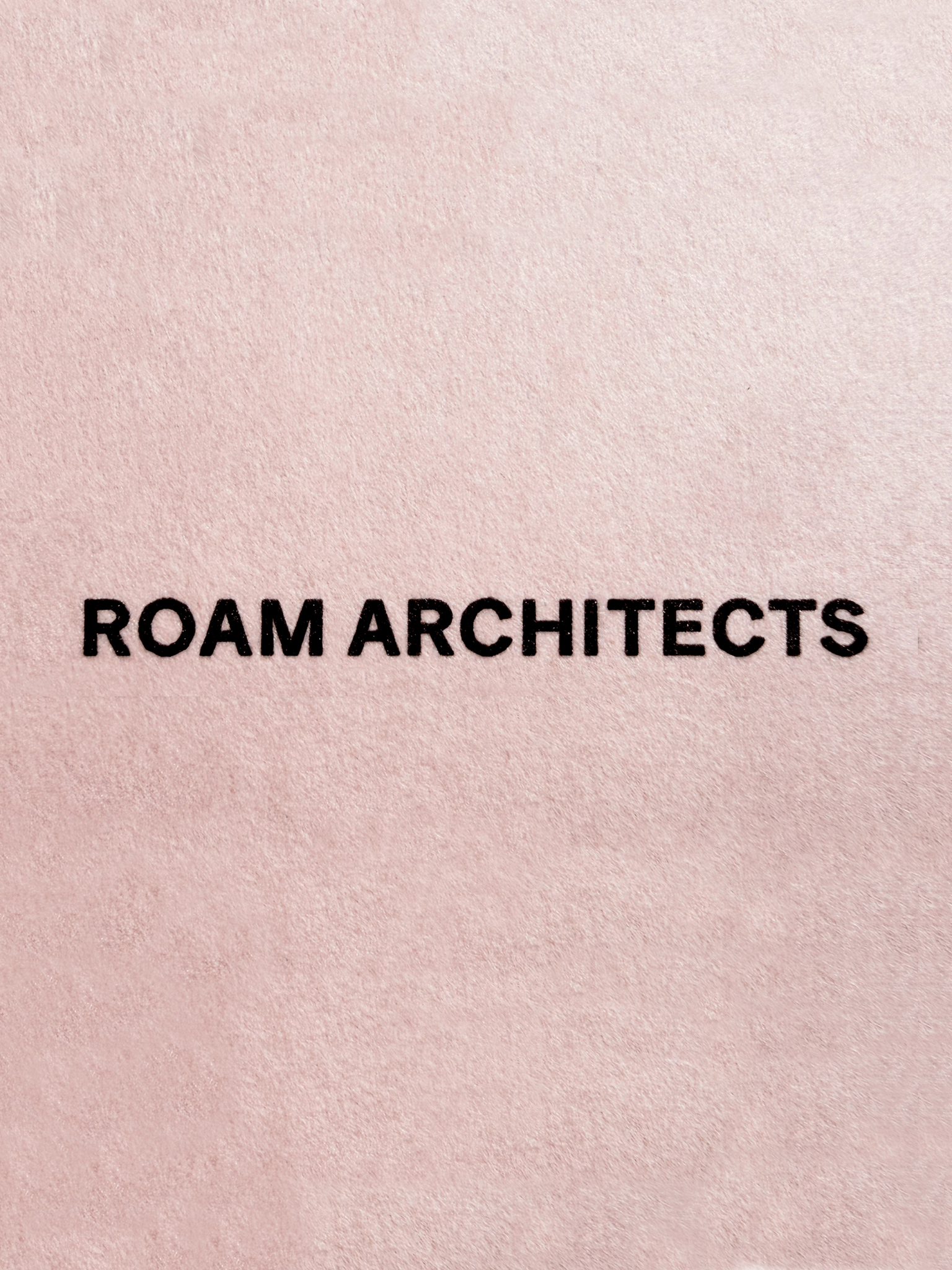
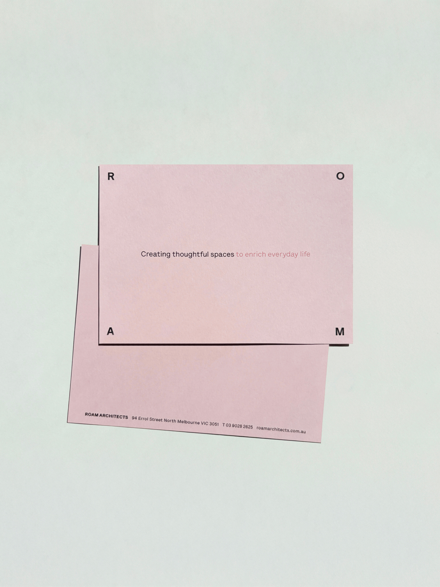
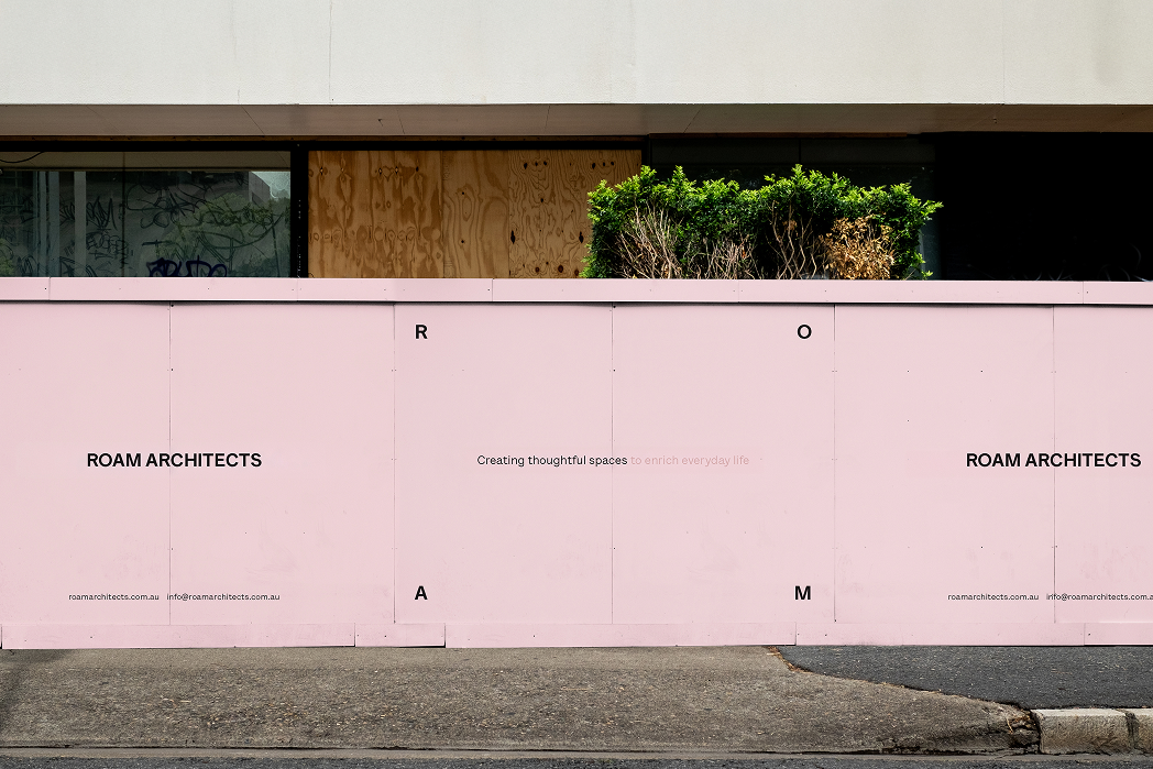
The identity is built around the relationship between people and space. Like the architecture itself, the ROAM logo responds to its environment, with the letterforms remaining fixed in size while the space between them expands and contracts and their position shifts to fill the available format. The result is a flexible mark that reflects the way ROAM views architecture, adapting to its surroundings while maintaining a consistent structure. Lettera Text LL brings a more distinctive, slightly quirky and approachable character to the brand, retaining the clarity of a sans while introducing a subtle sense of personality. A tonal palette of soft pink and blush creates a warm and restrained foundation, with warm red used sparingly to introduce moments of surprise.




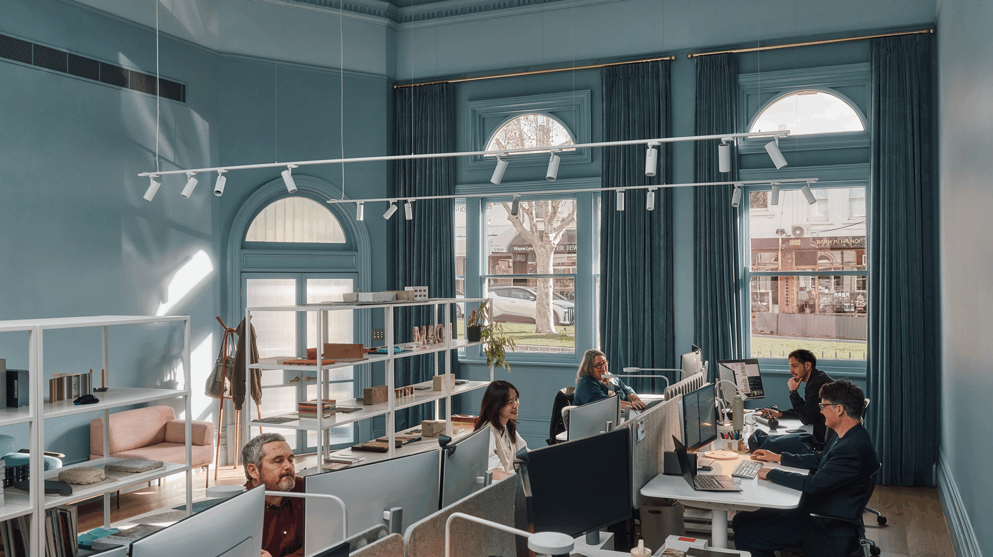
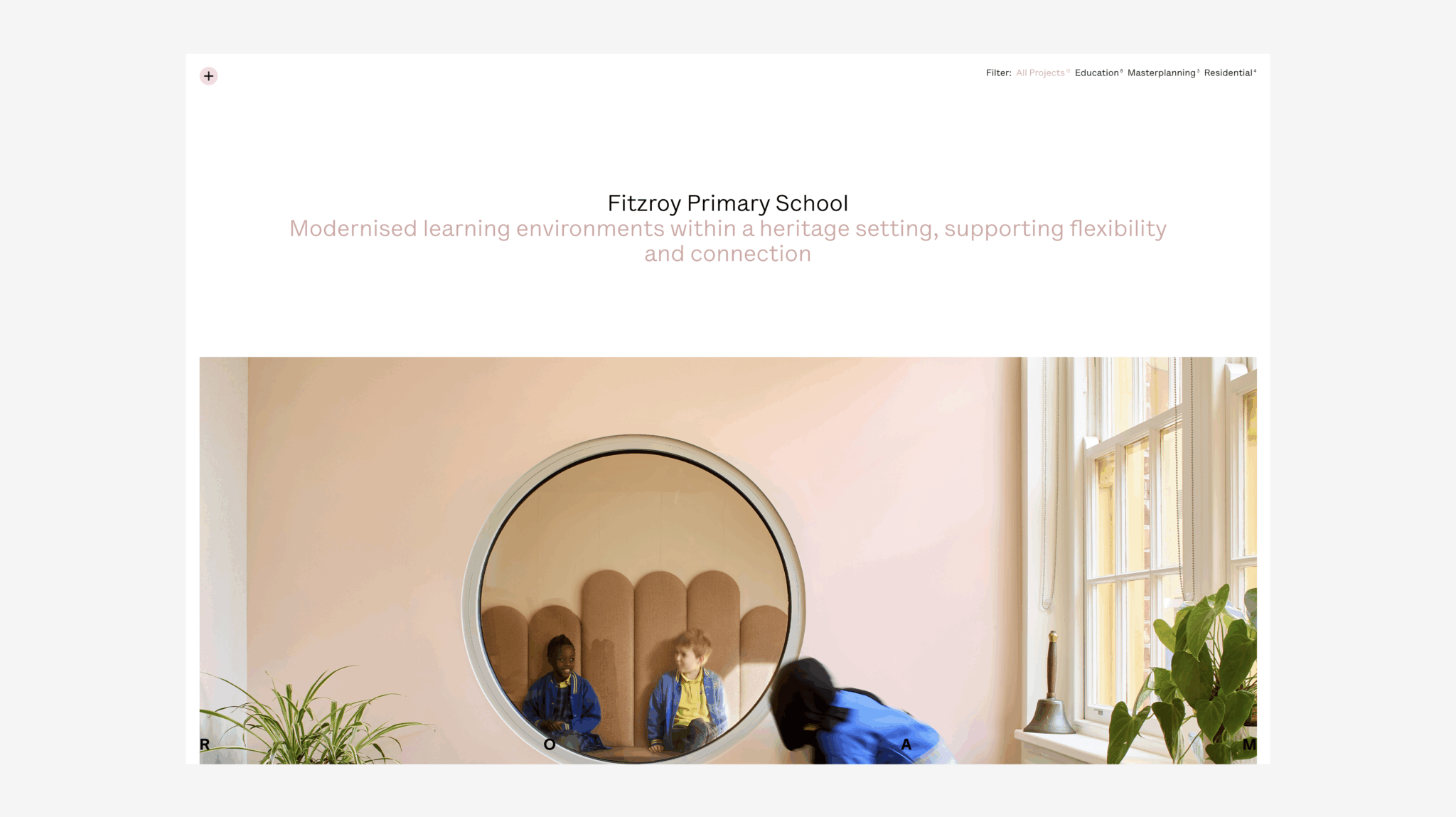
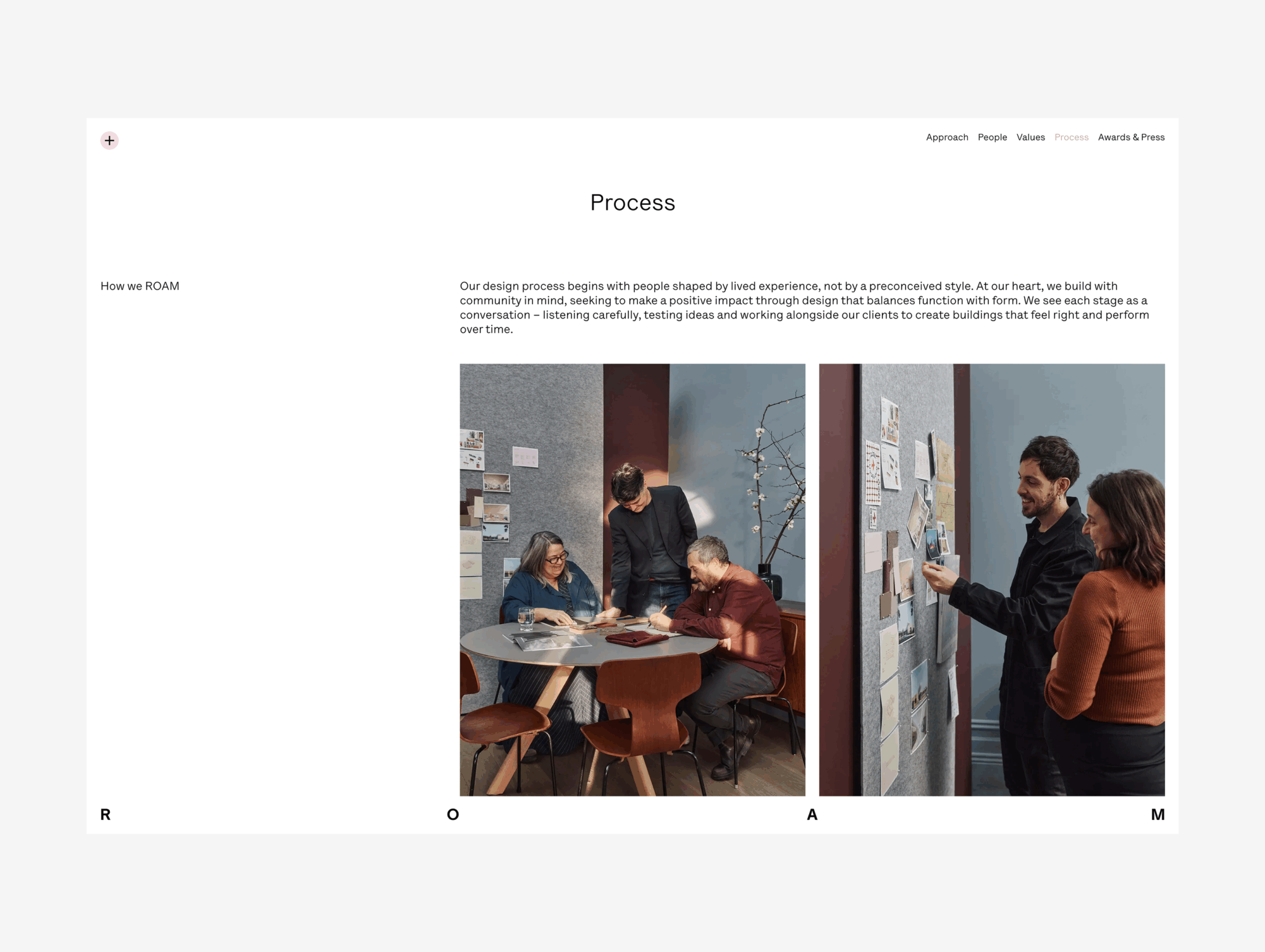
Photography shifts the focus towards the people, details and moments that make a place feel lived in. We art directed a new suite of studio photography and motion, capturing the ROAM team in a more natural and unforced way and offering a more personal introduction to the people behind the practice.

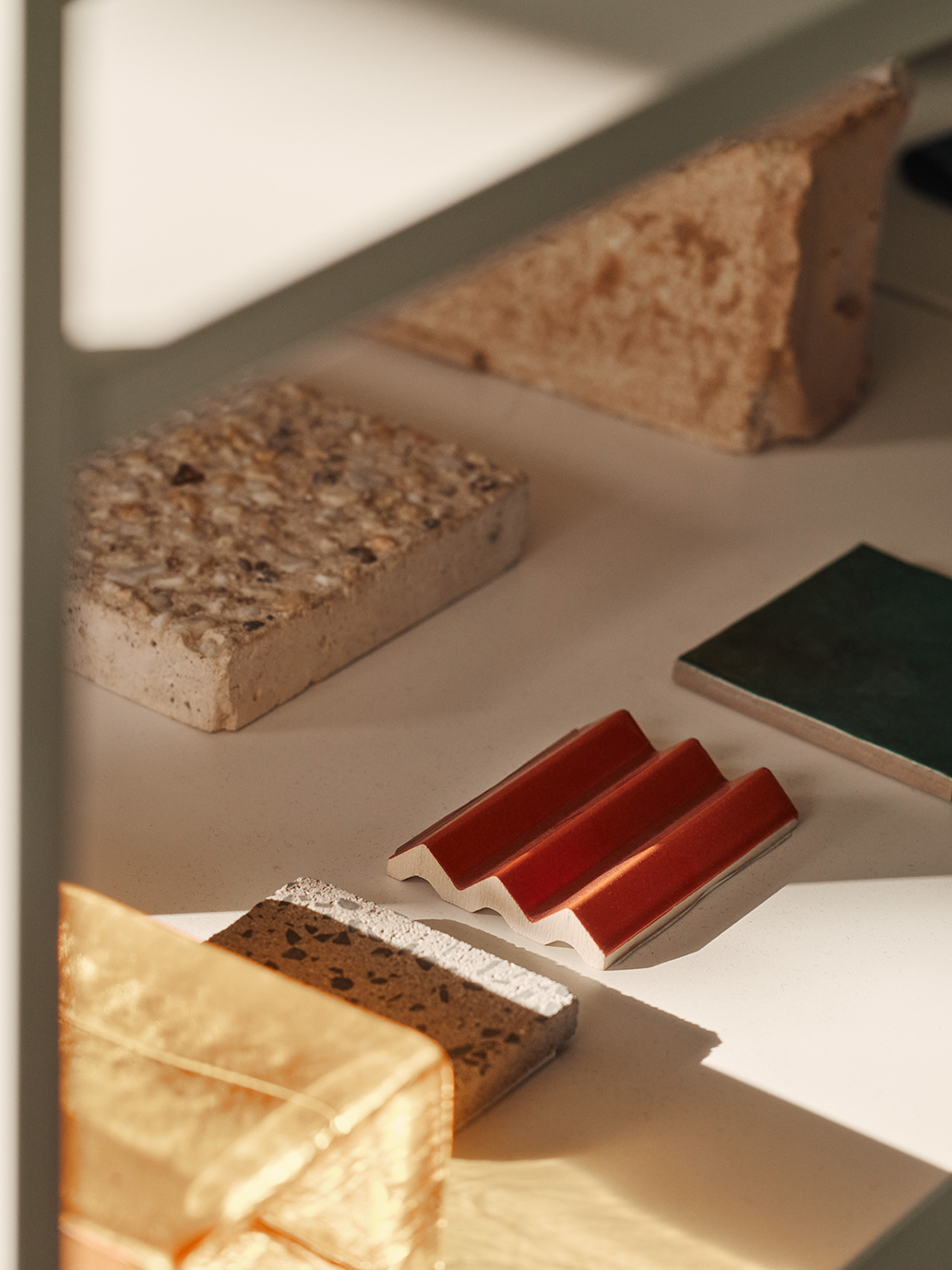
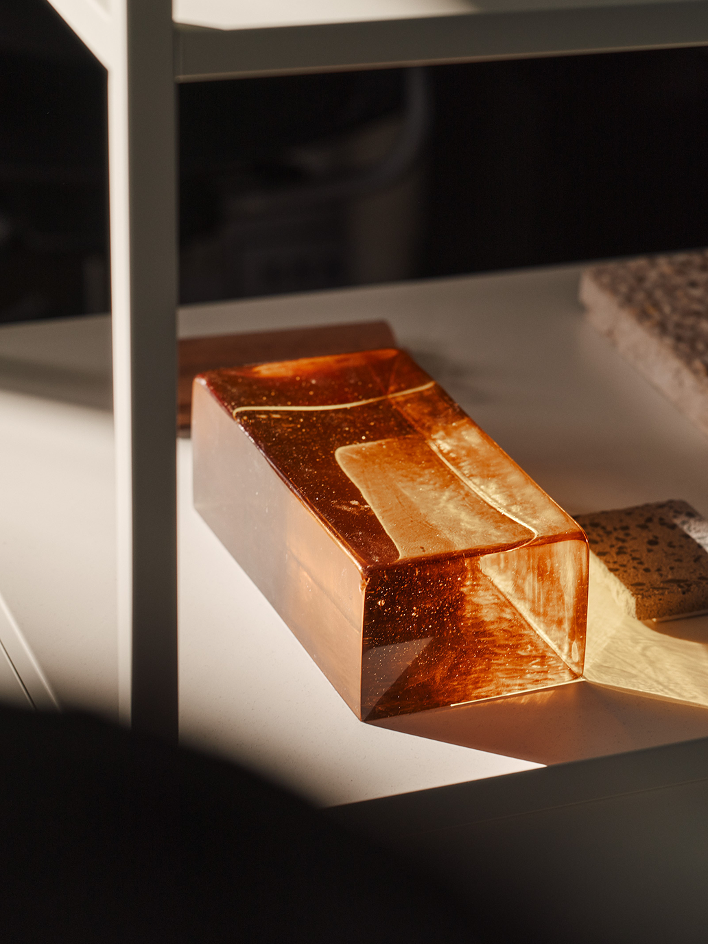
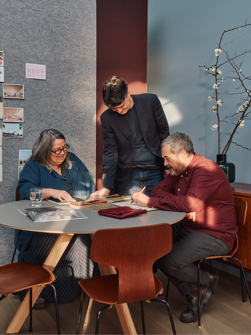

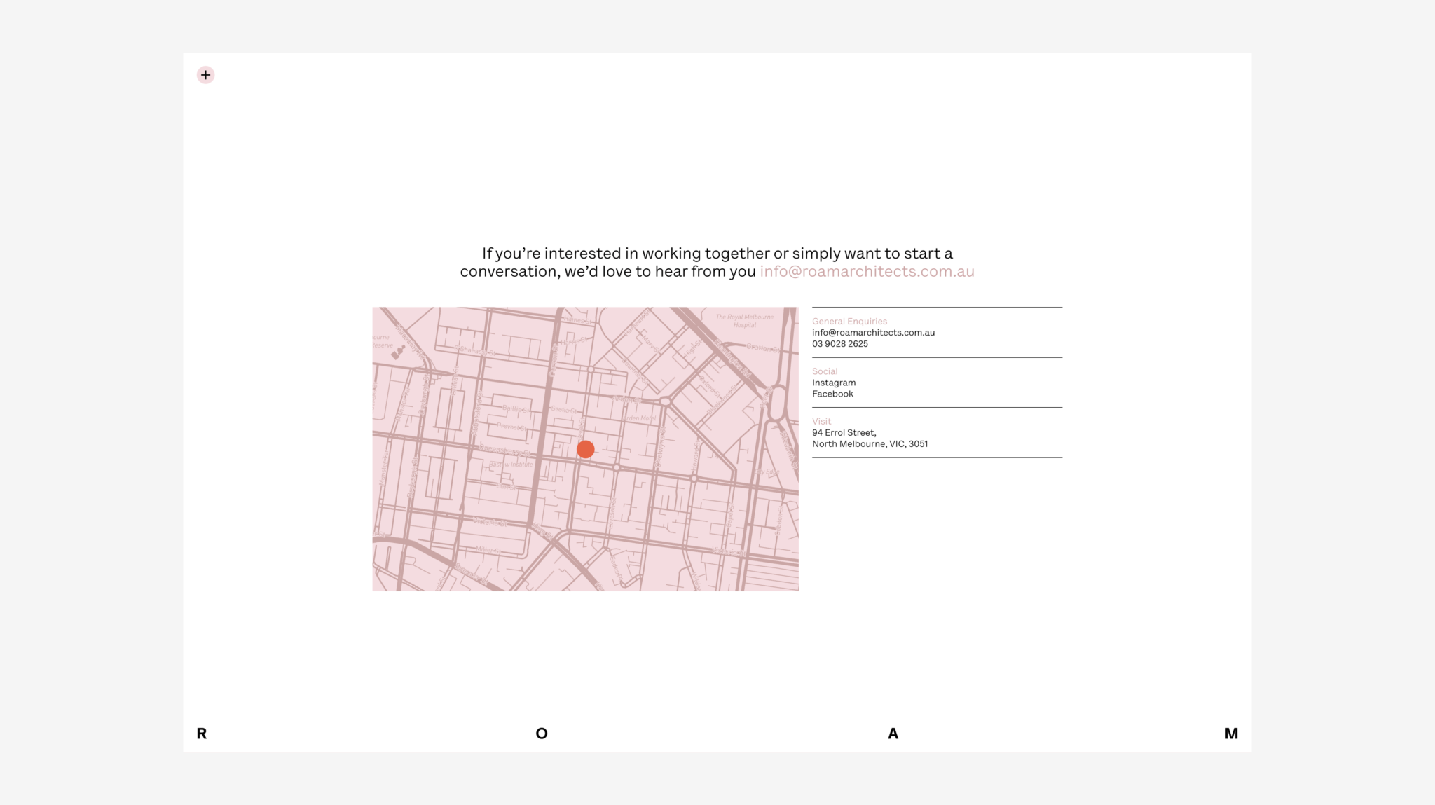
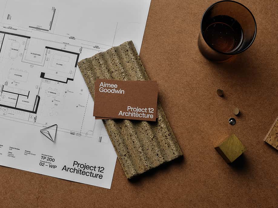
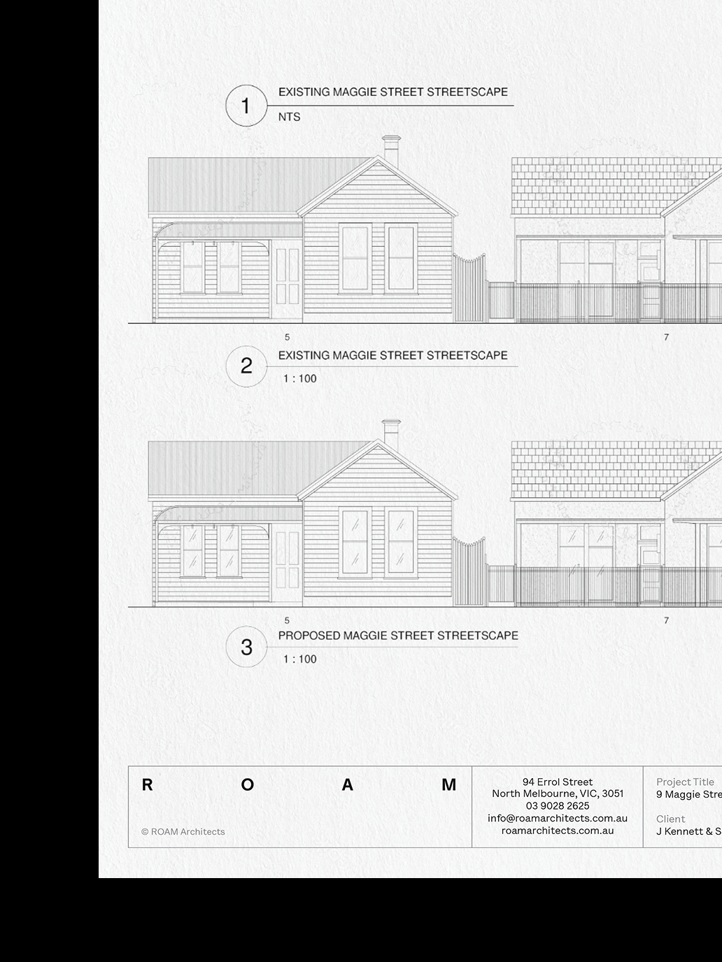
The new brand was carried through into ROAM’s website, stationery, signage, wayfinding, project documentation and digital communications, creating a consistent experience across every touchpoint. The result is an identity that feels more like ROAM—thoughtful and considered, but also curious, joyful and open to possibility. A flexible brand system designed to evolve with the practice and communicate the human thinking behind the architecture.